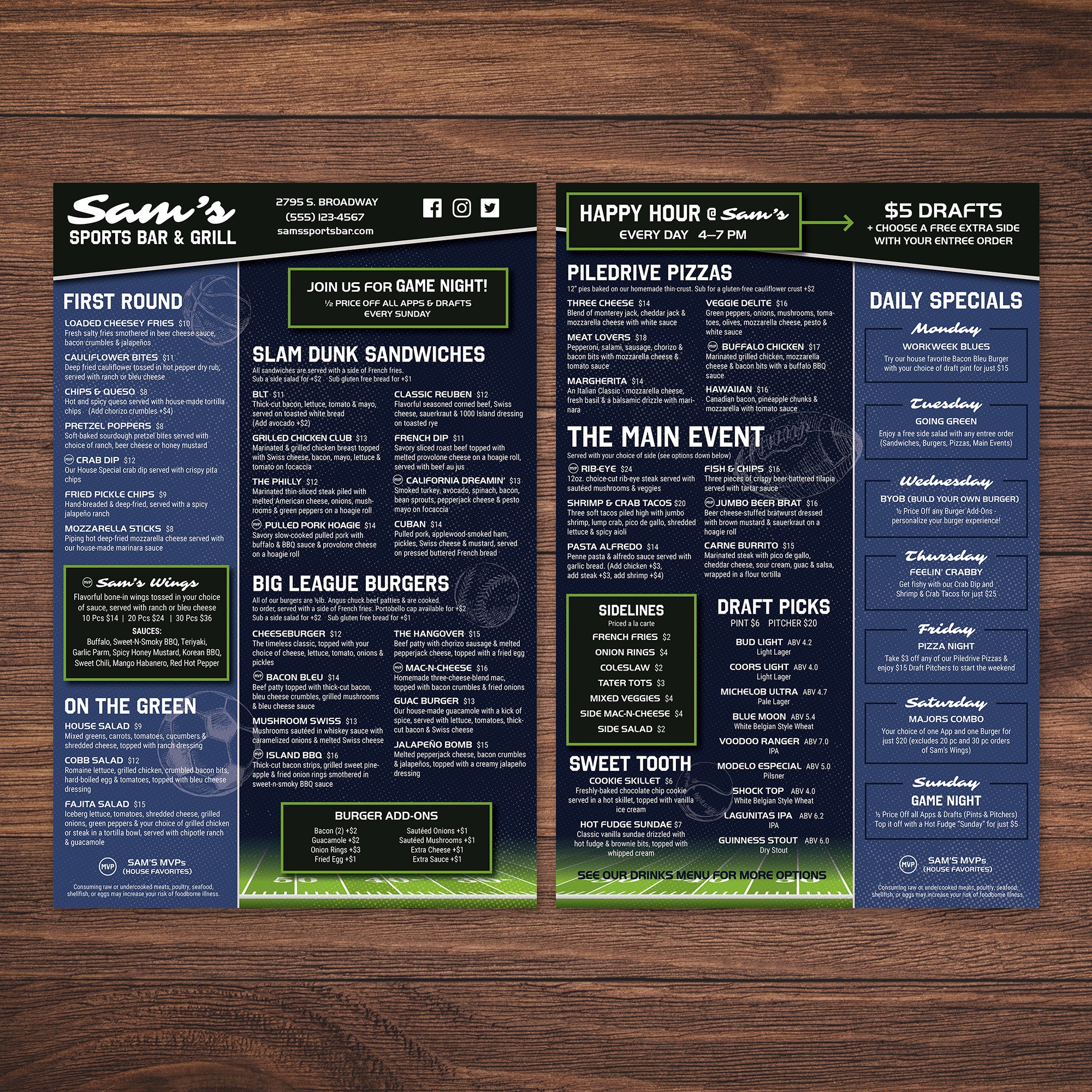
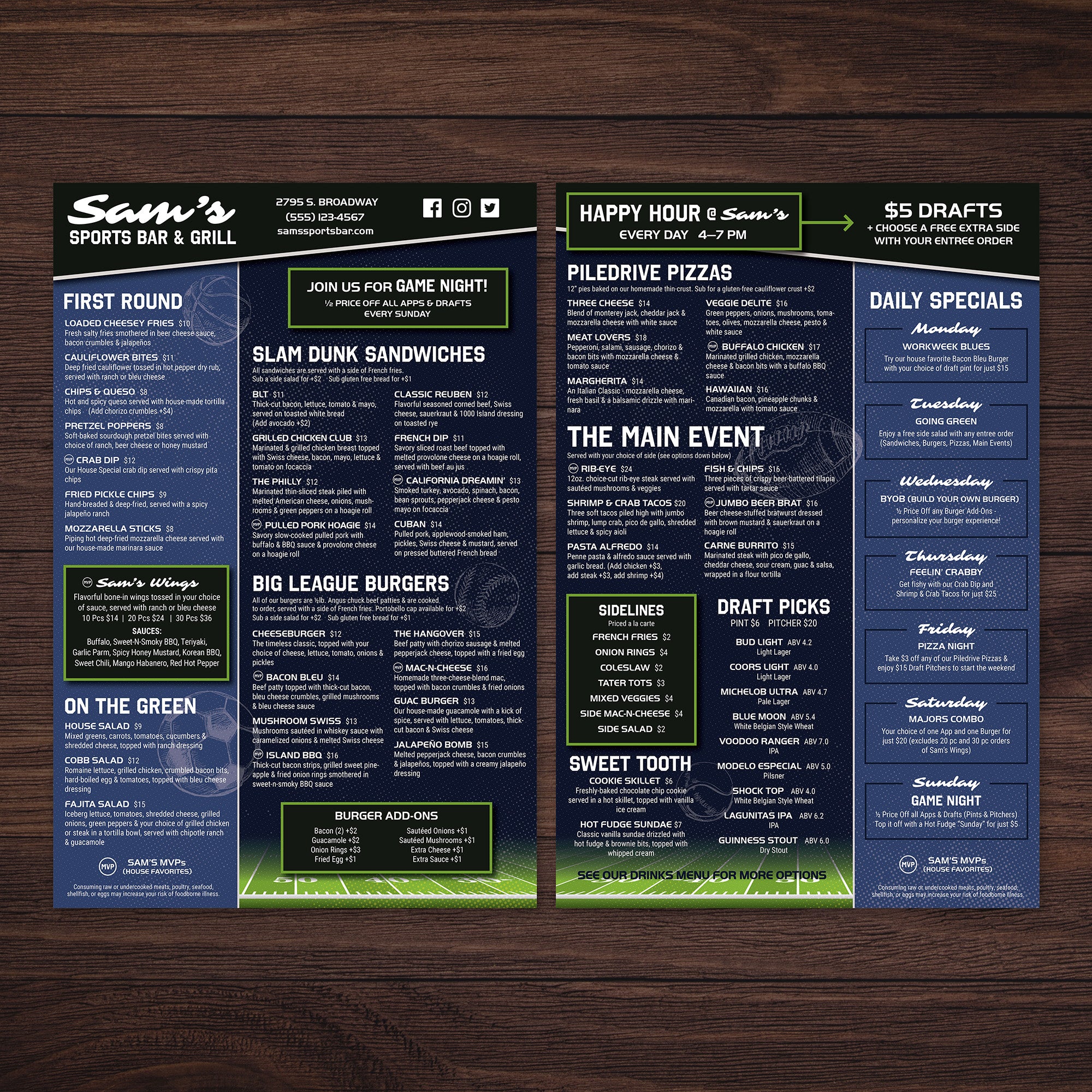
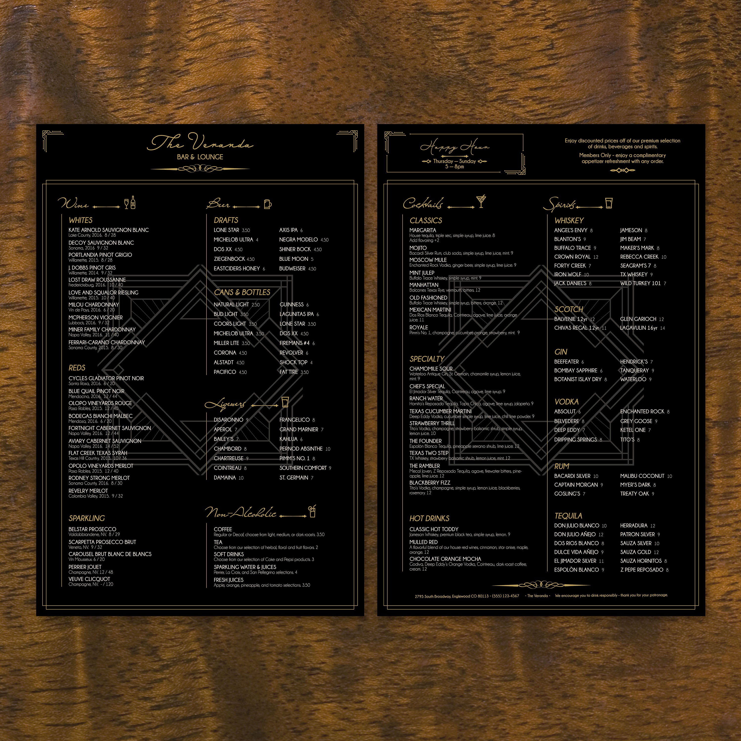
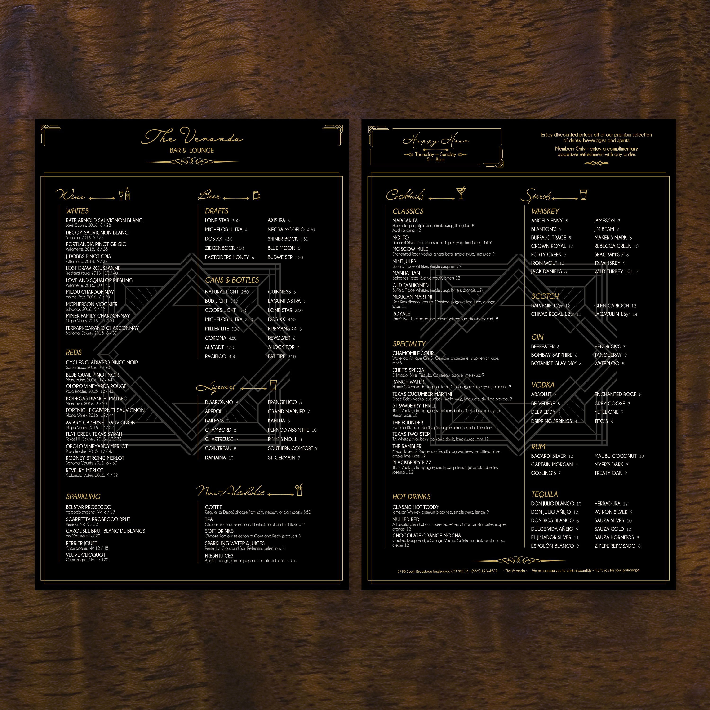
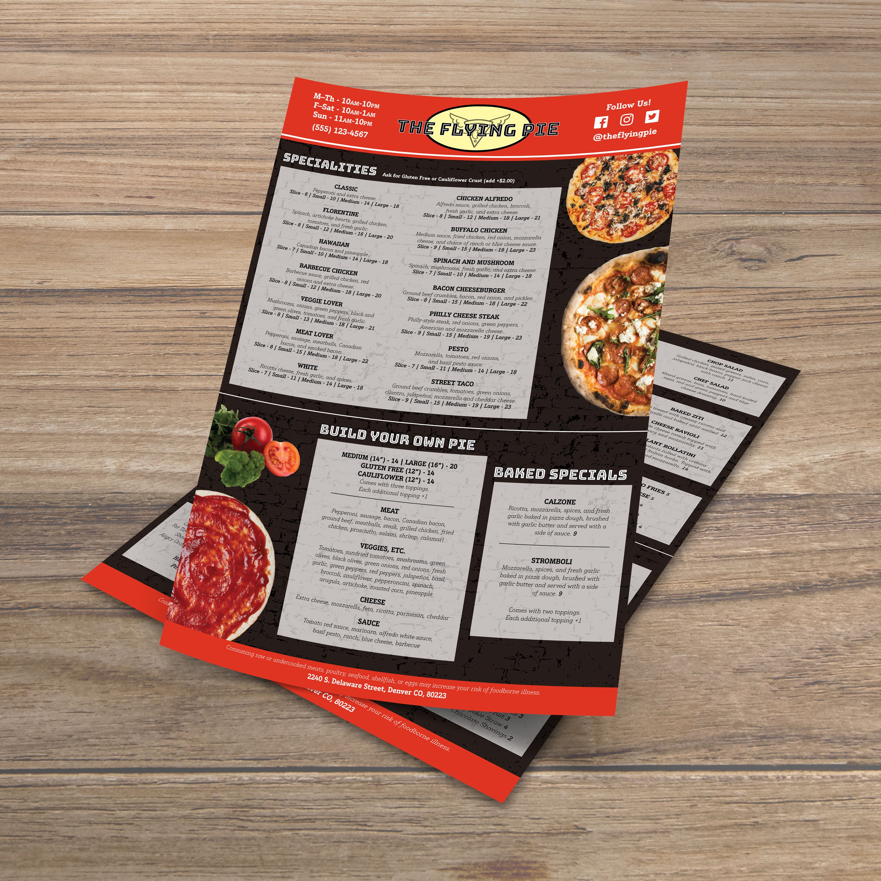
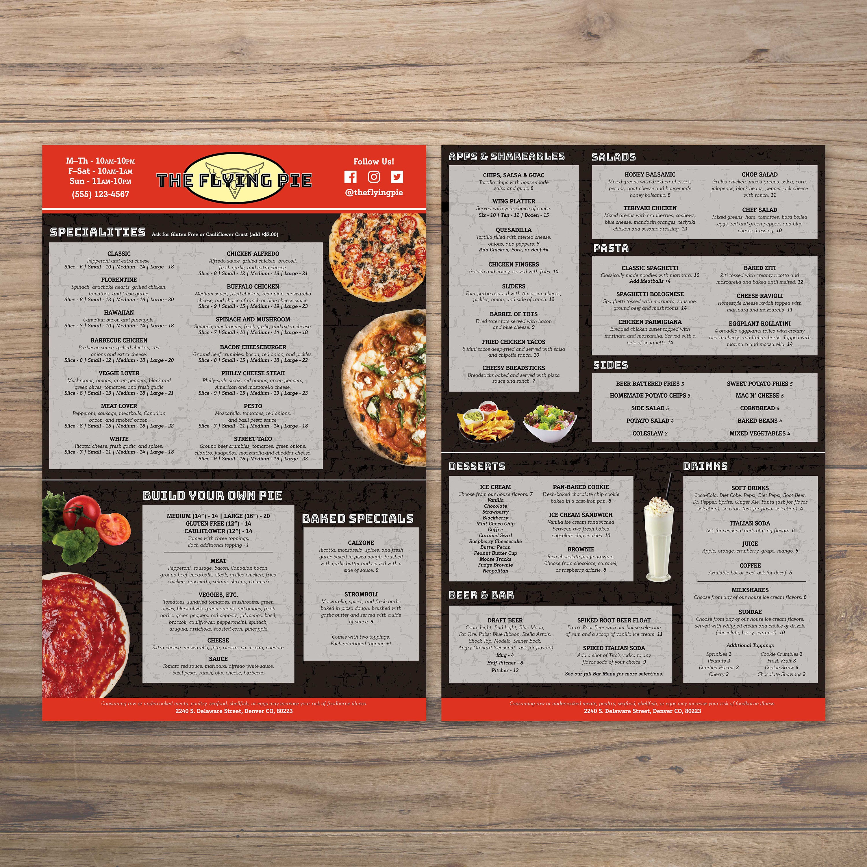
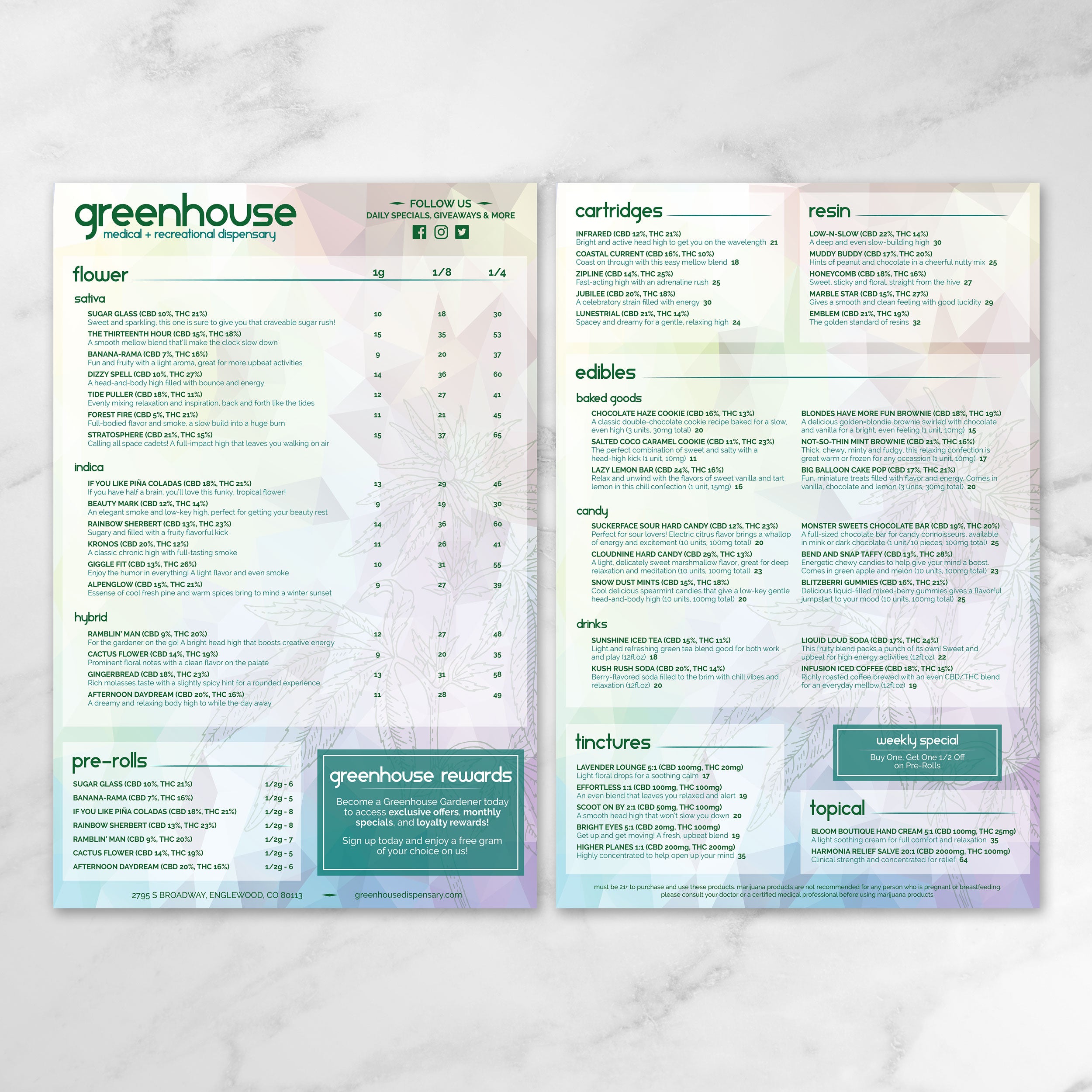
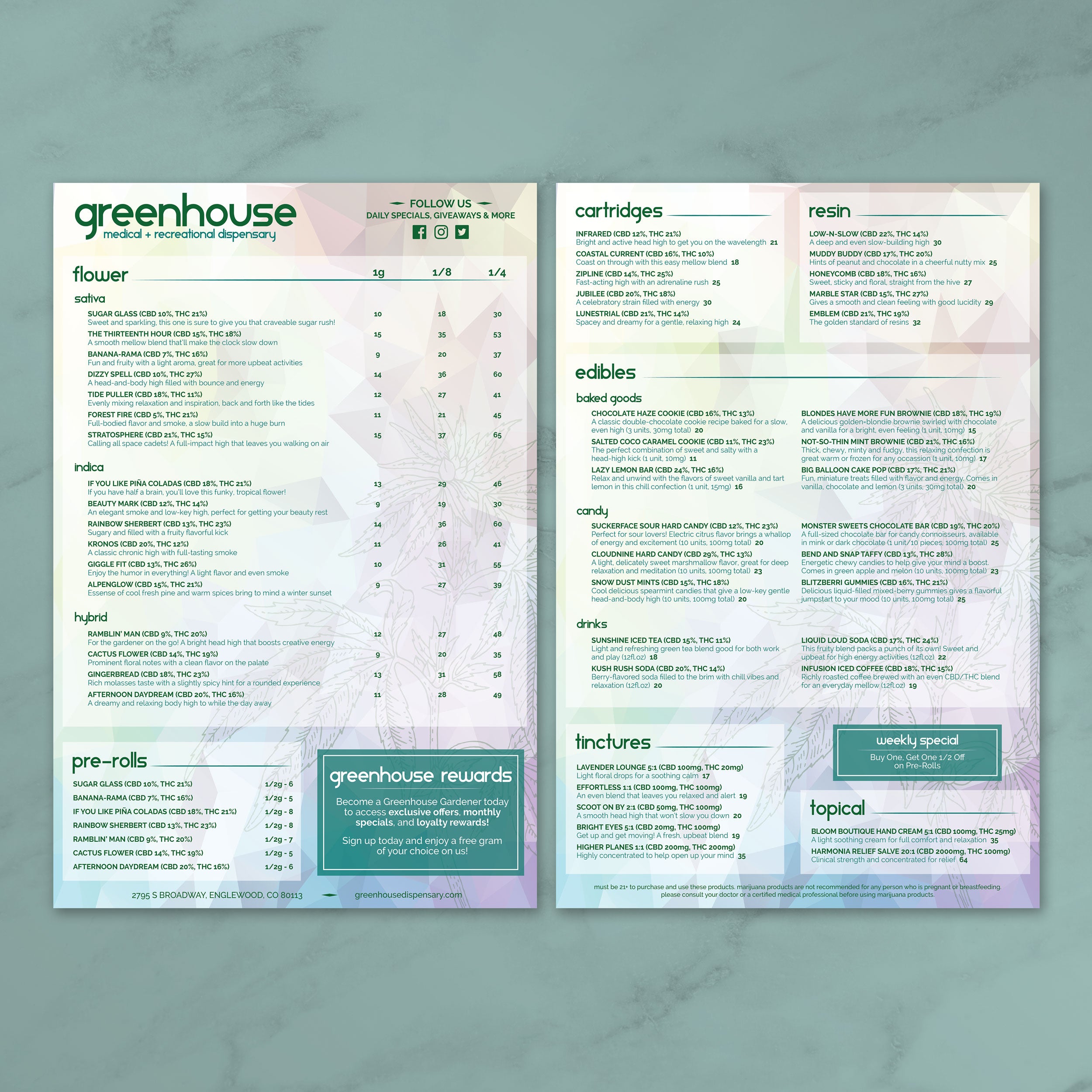
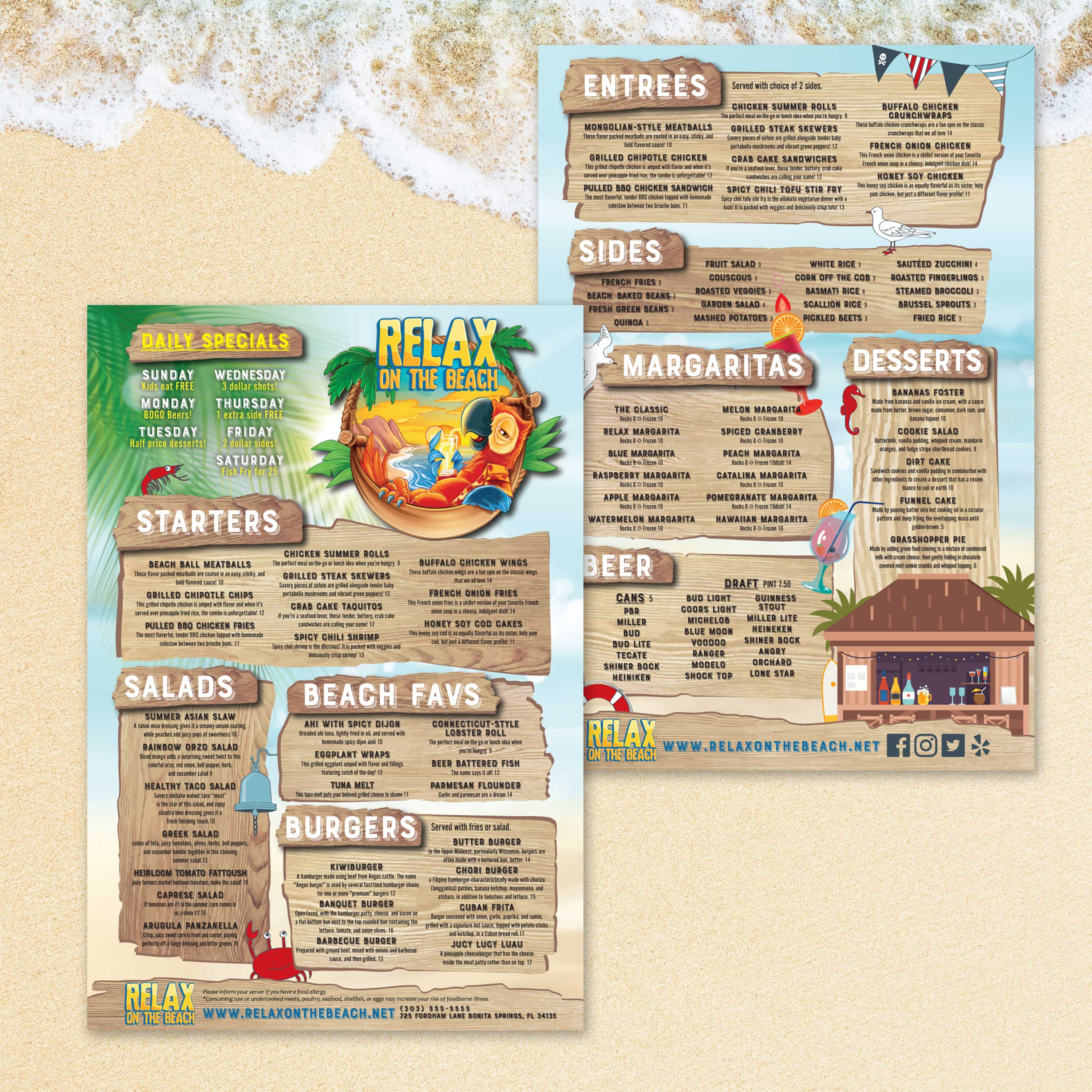
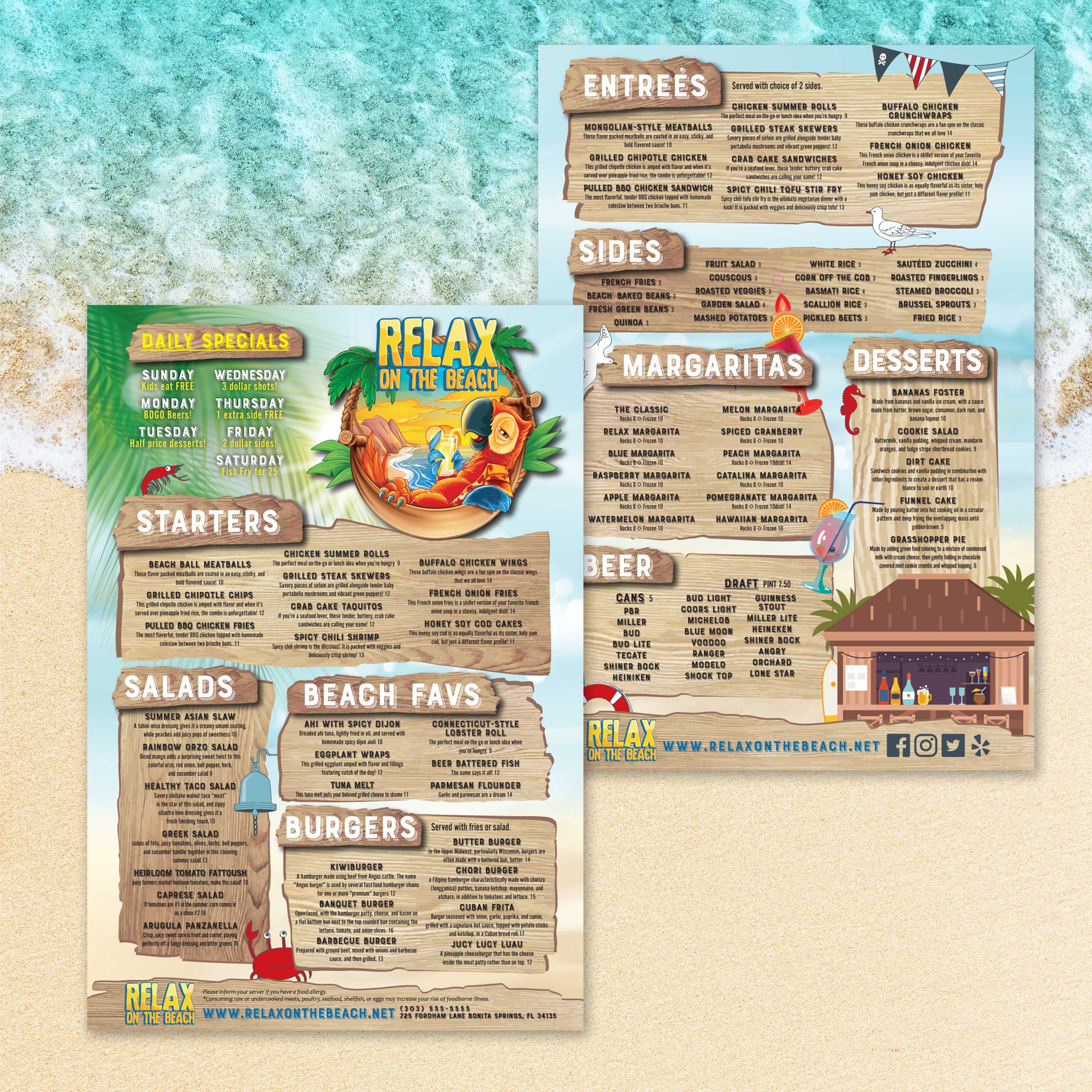
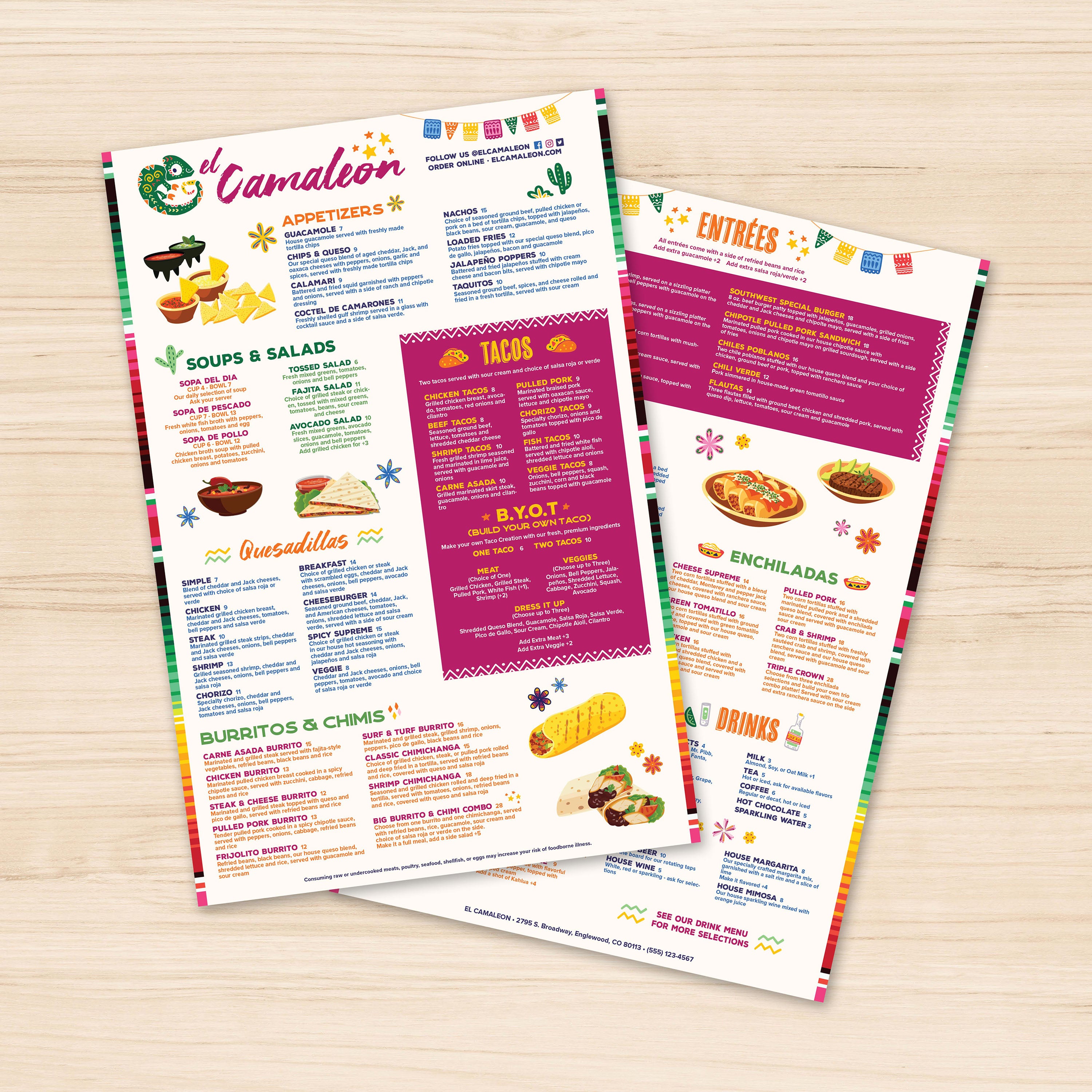
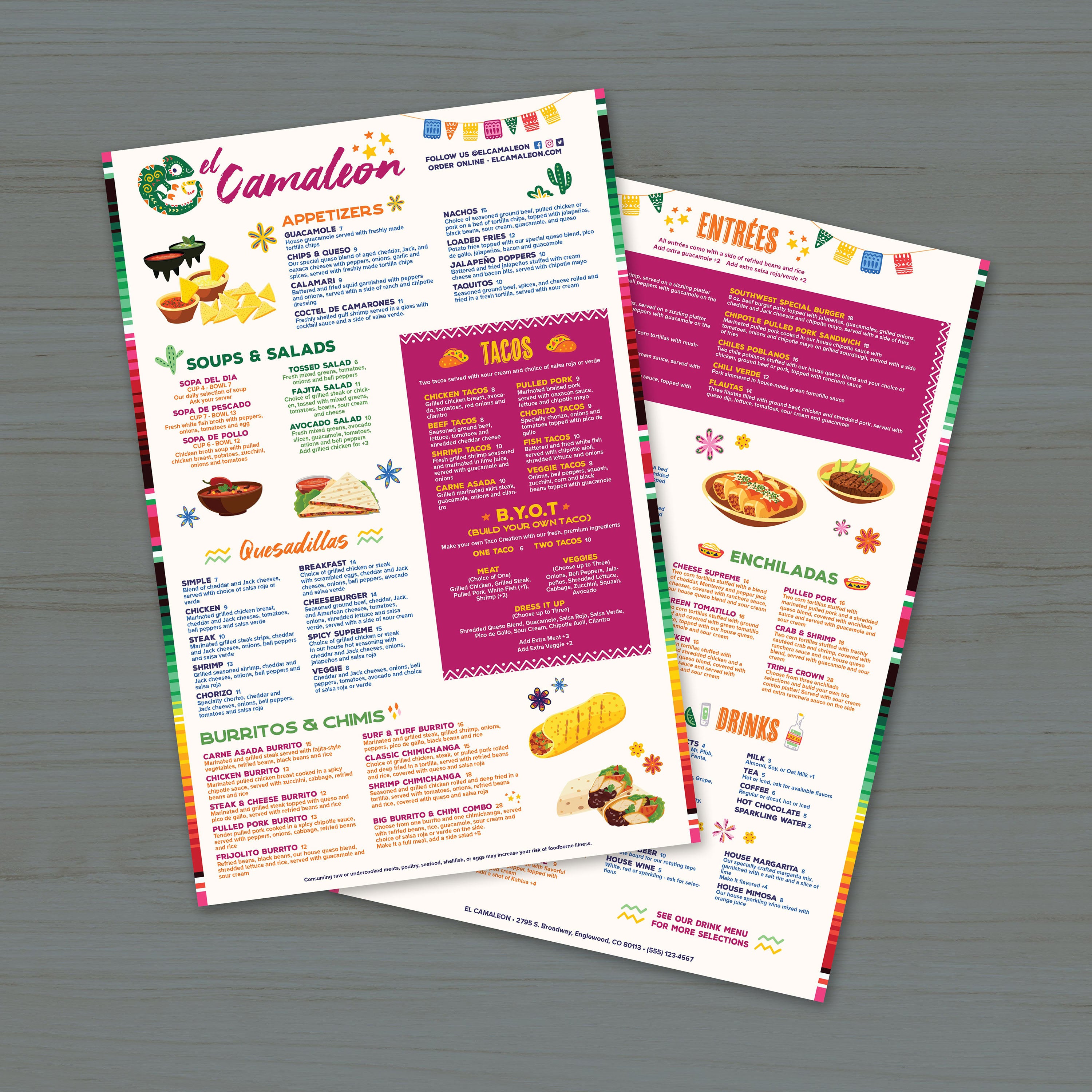
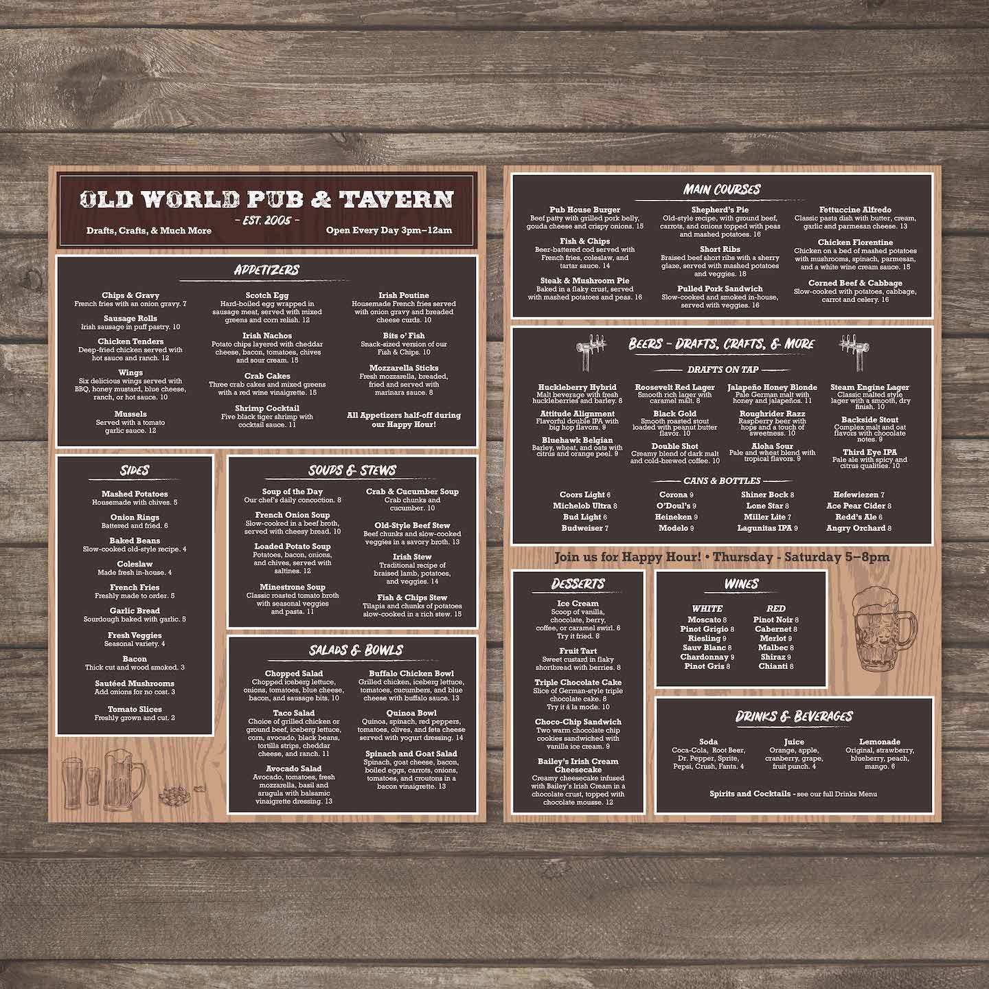
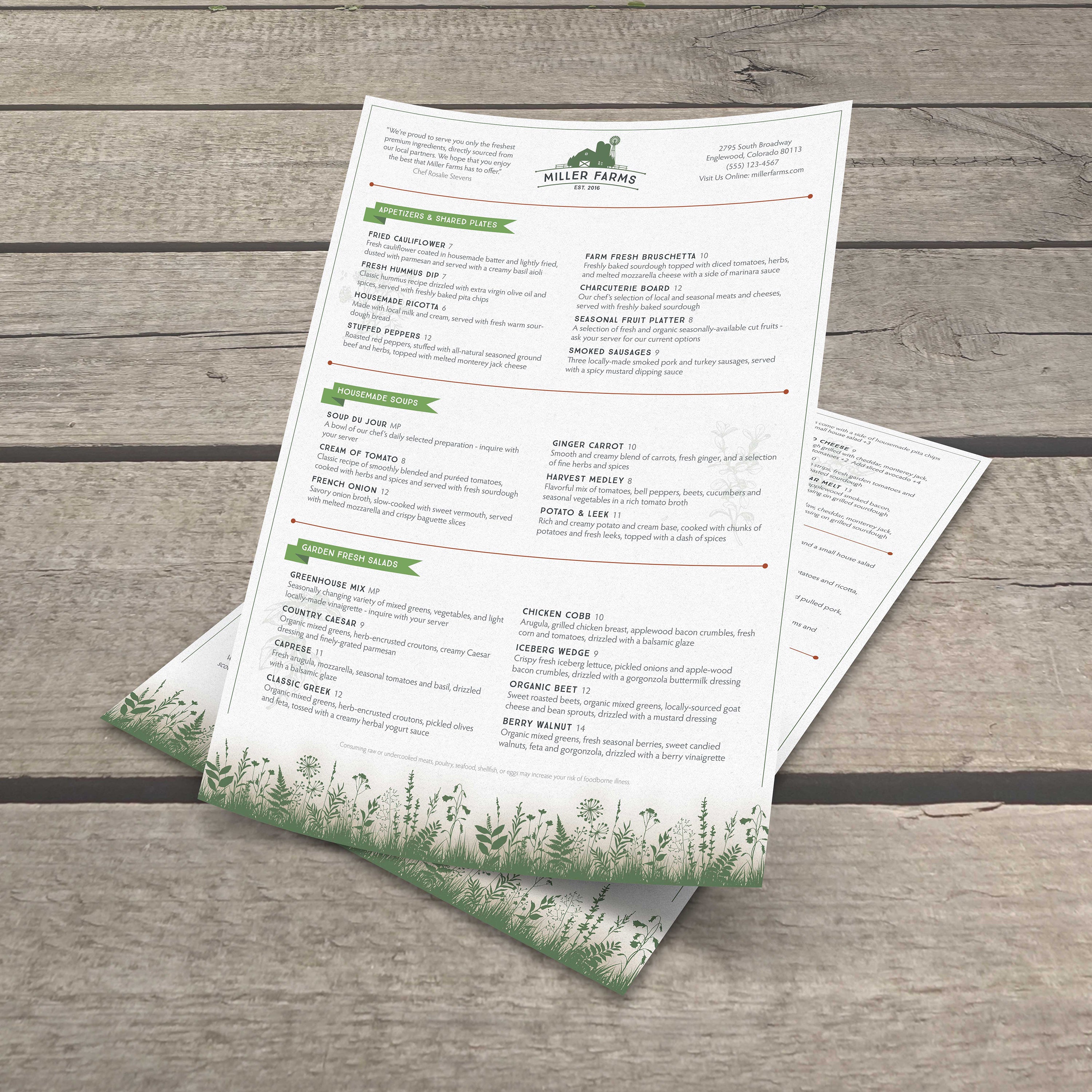
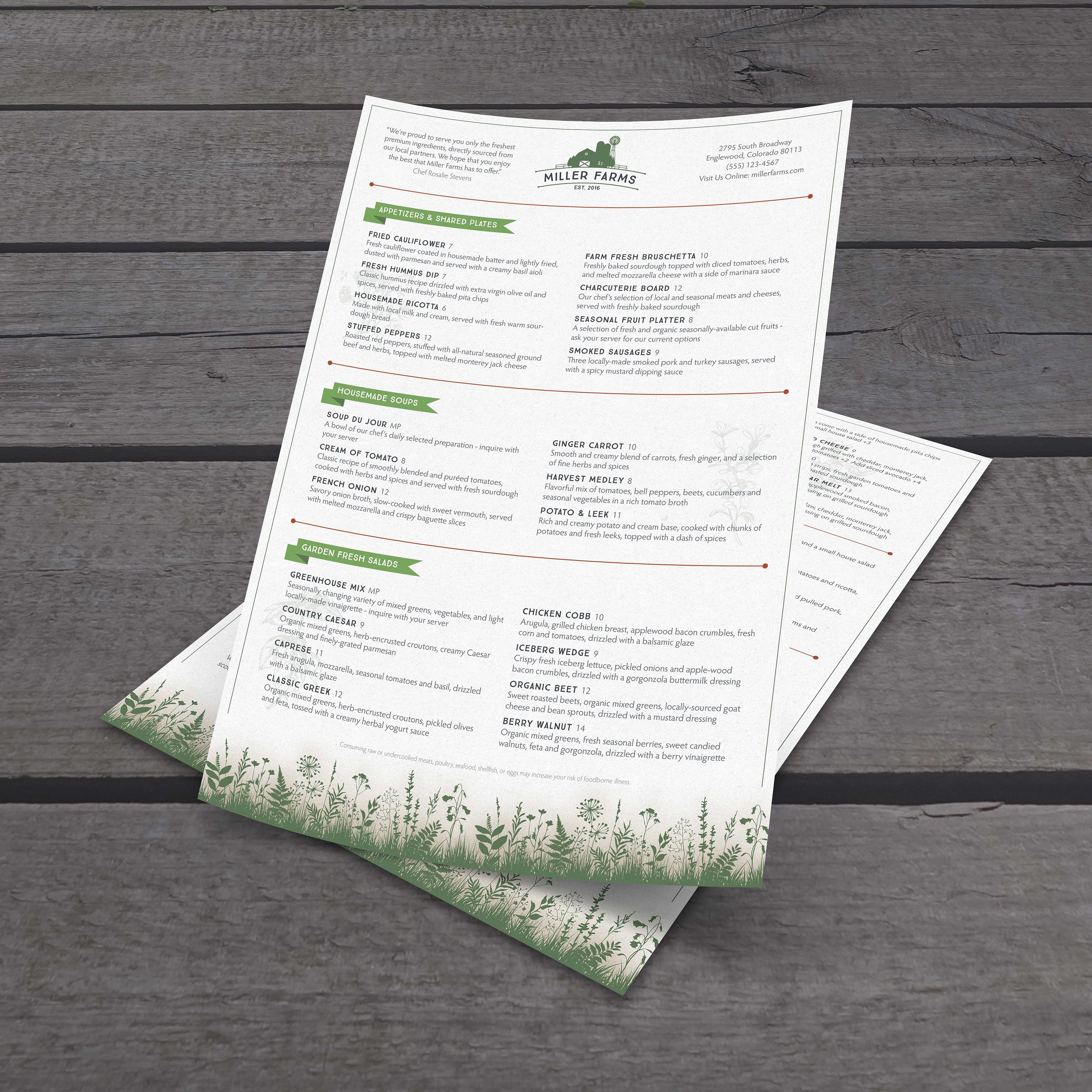
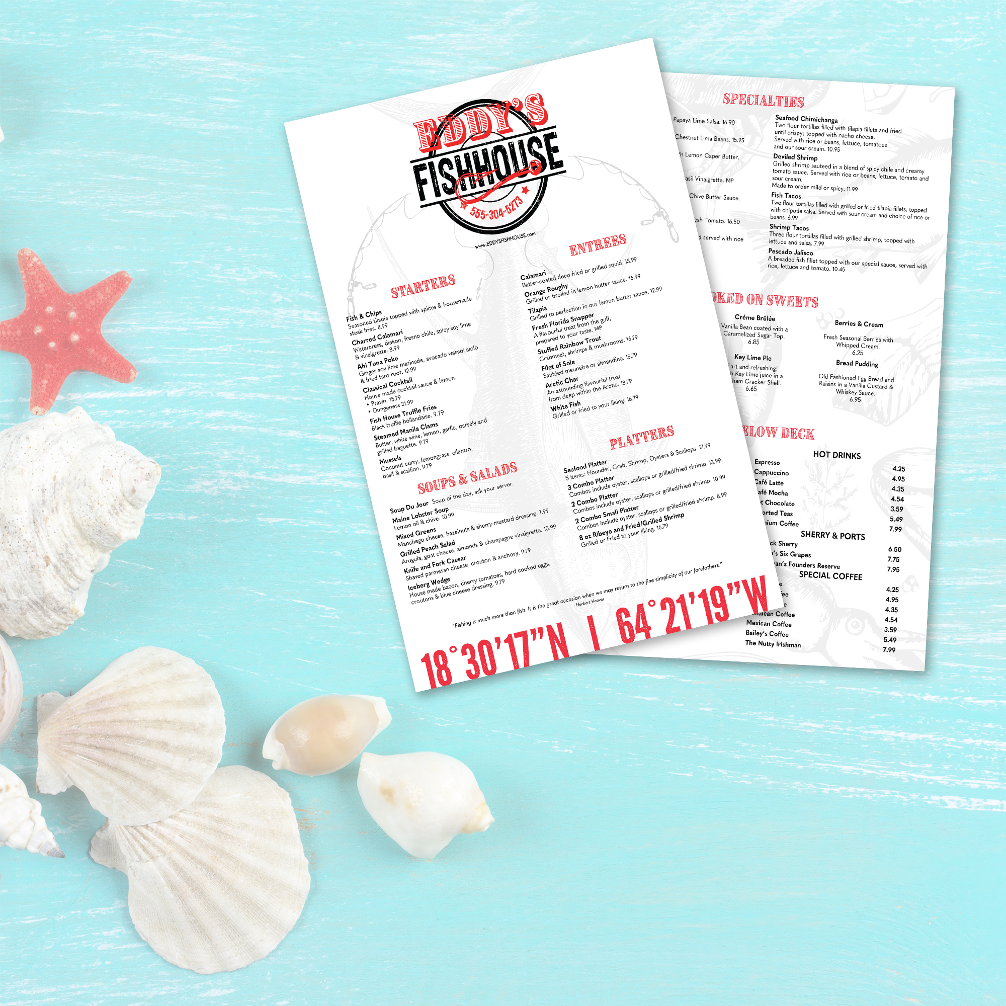
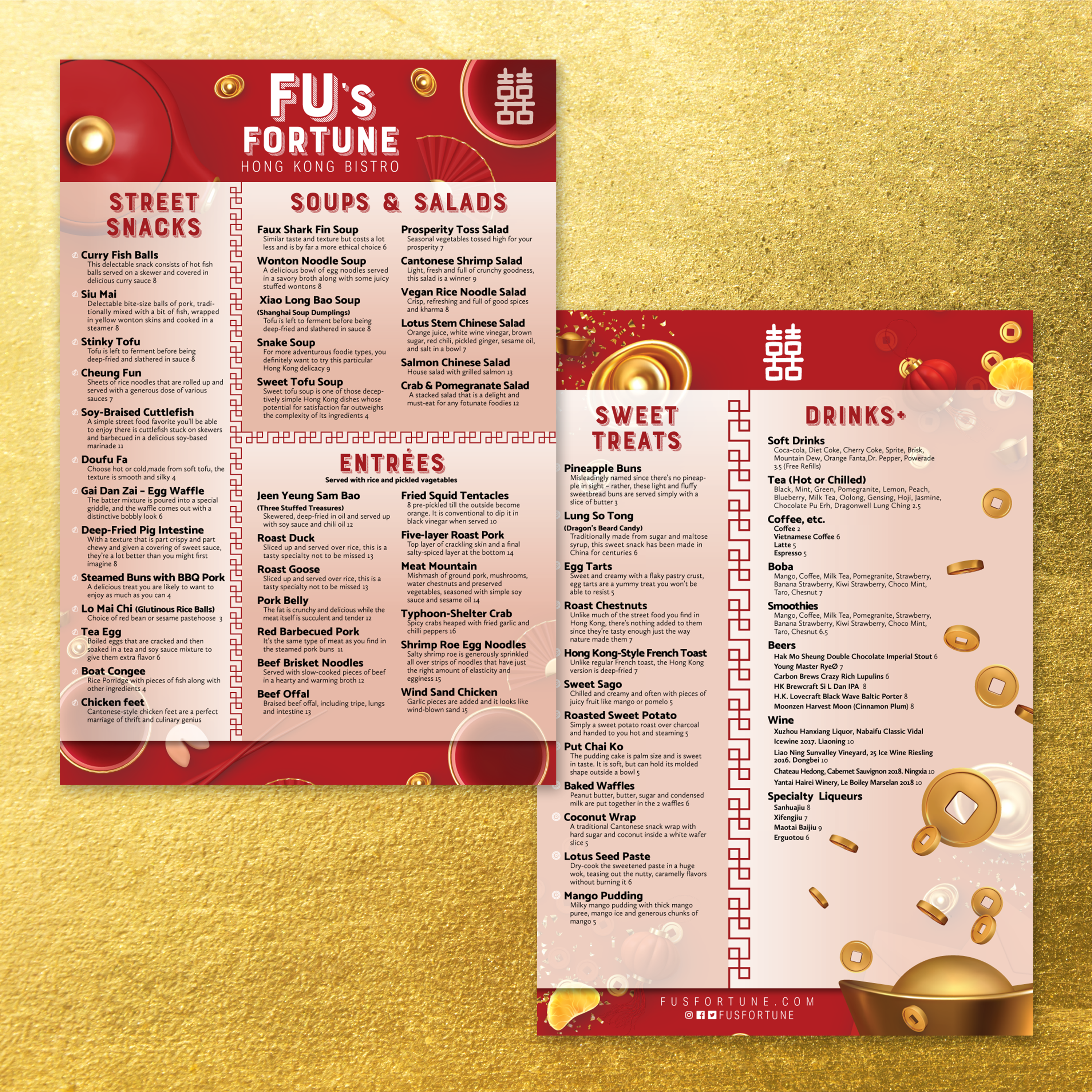
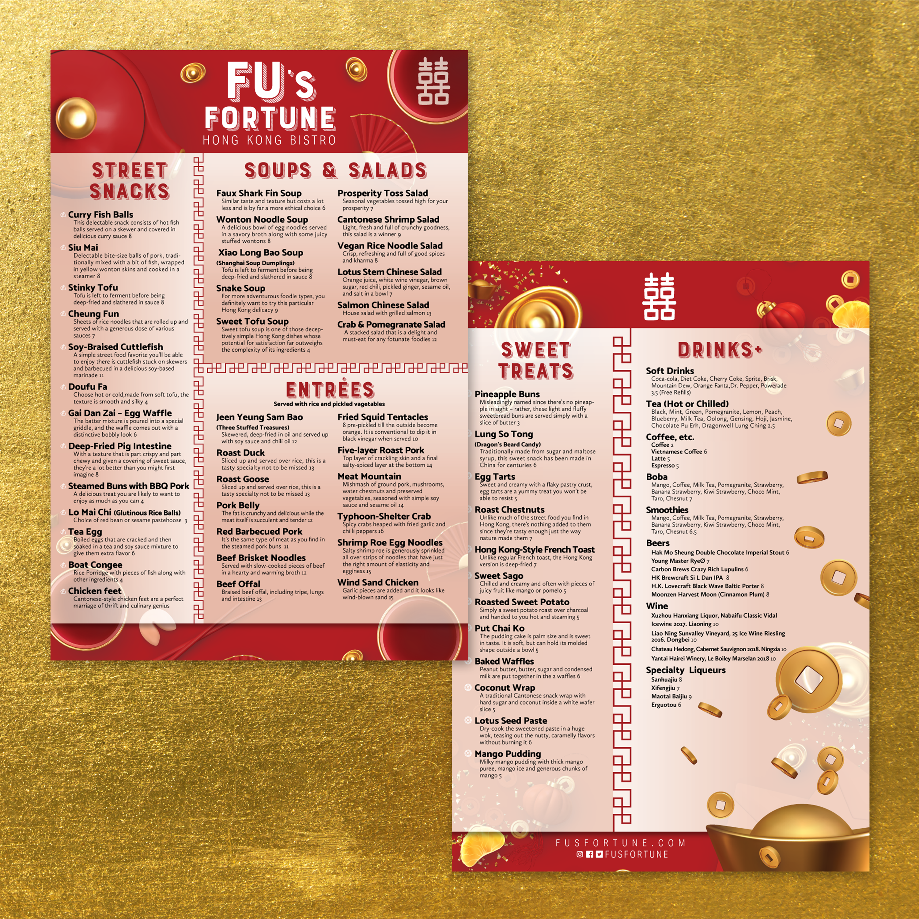
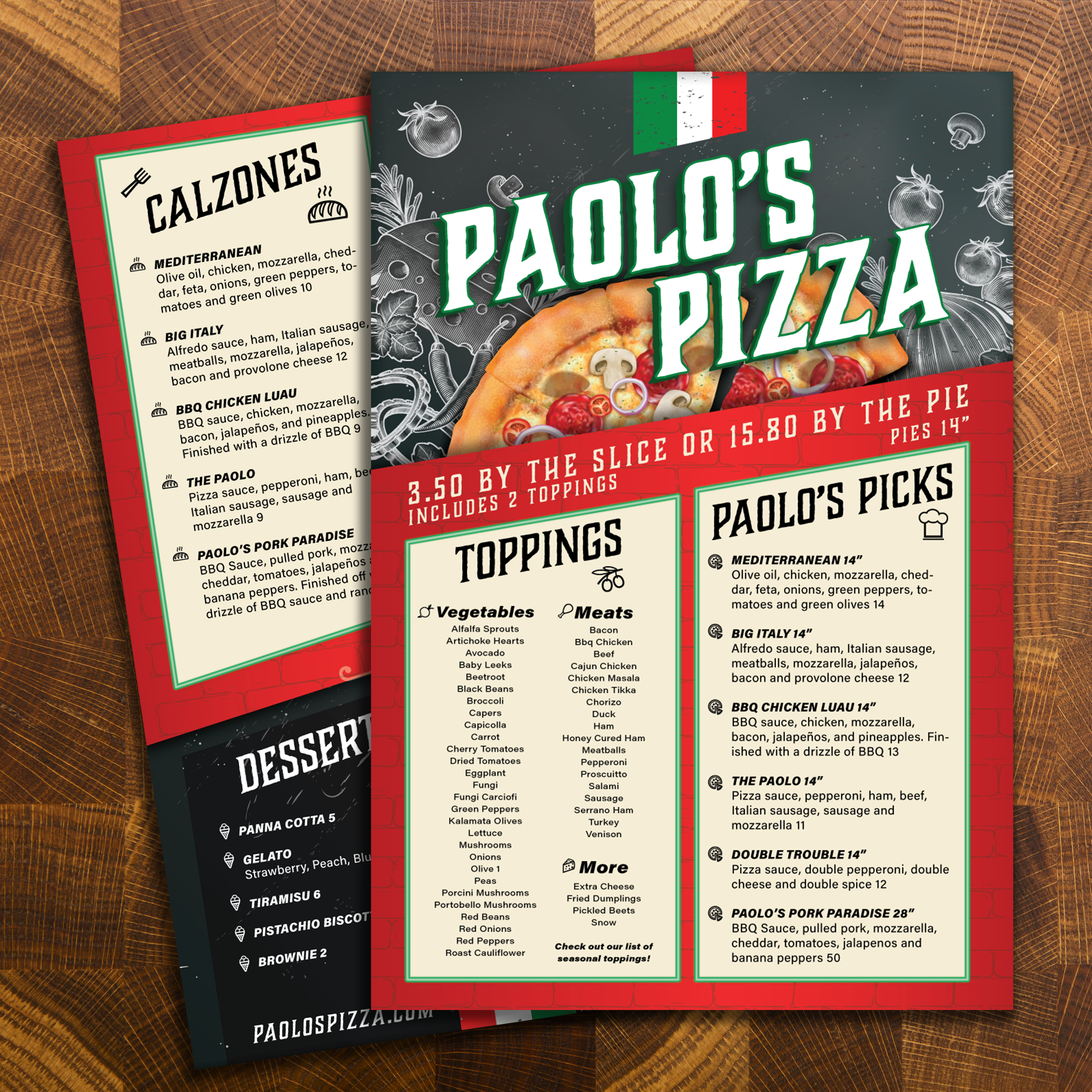
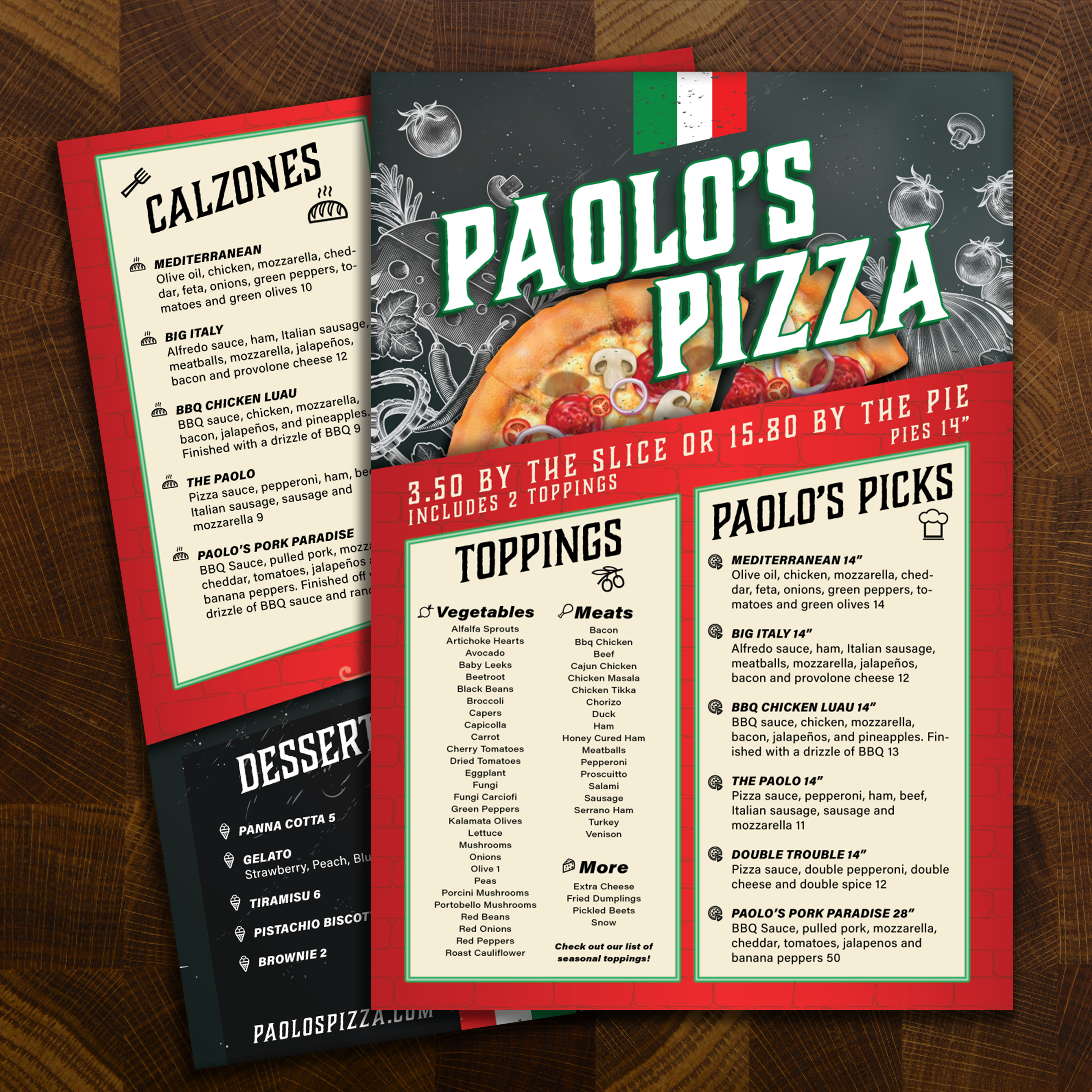
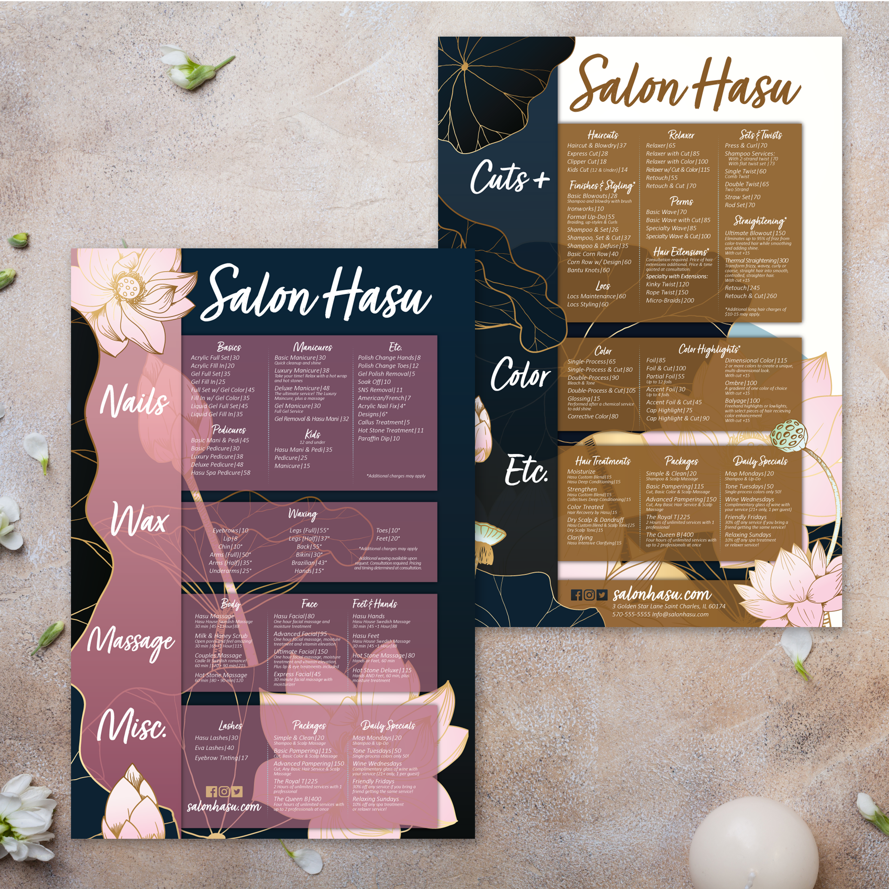
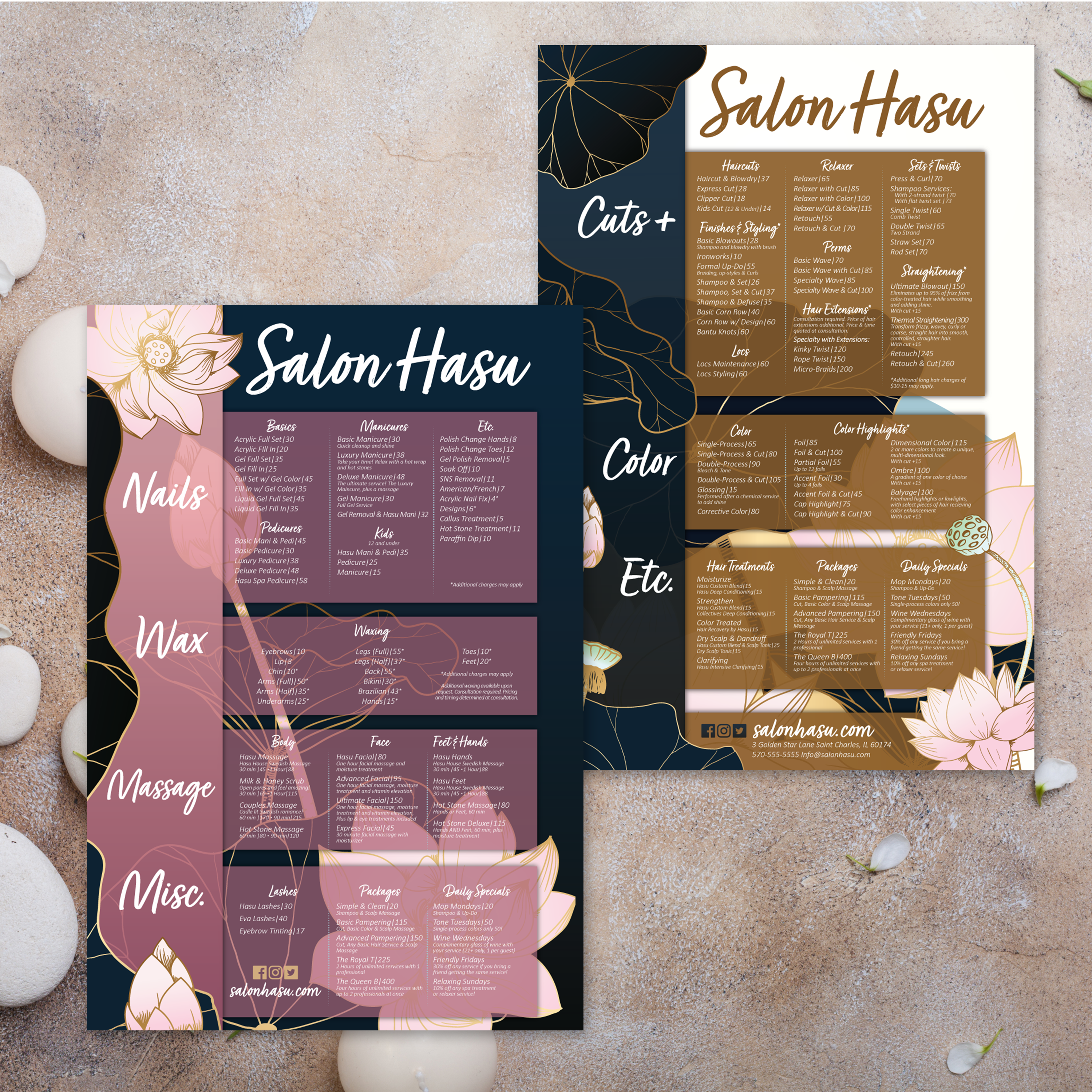
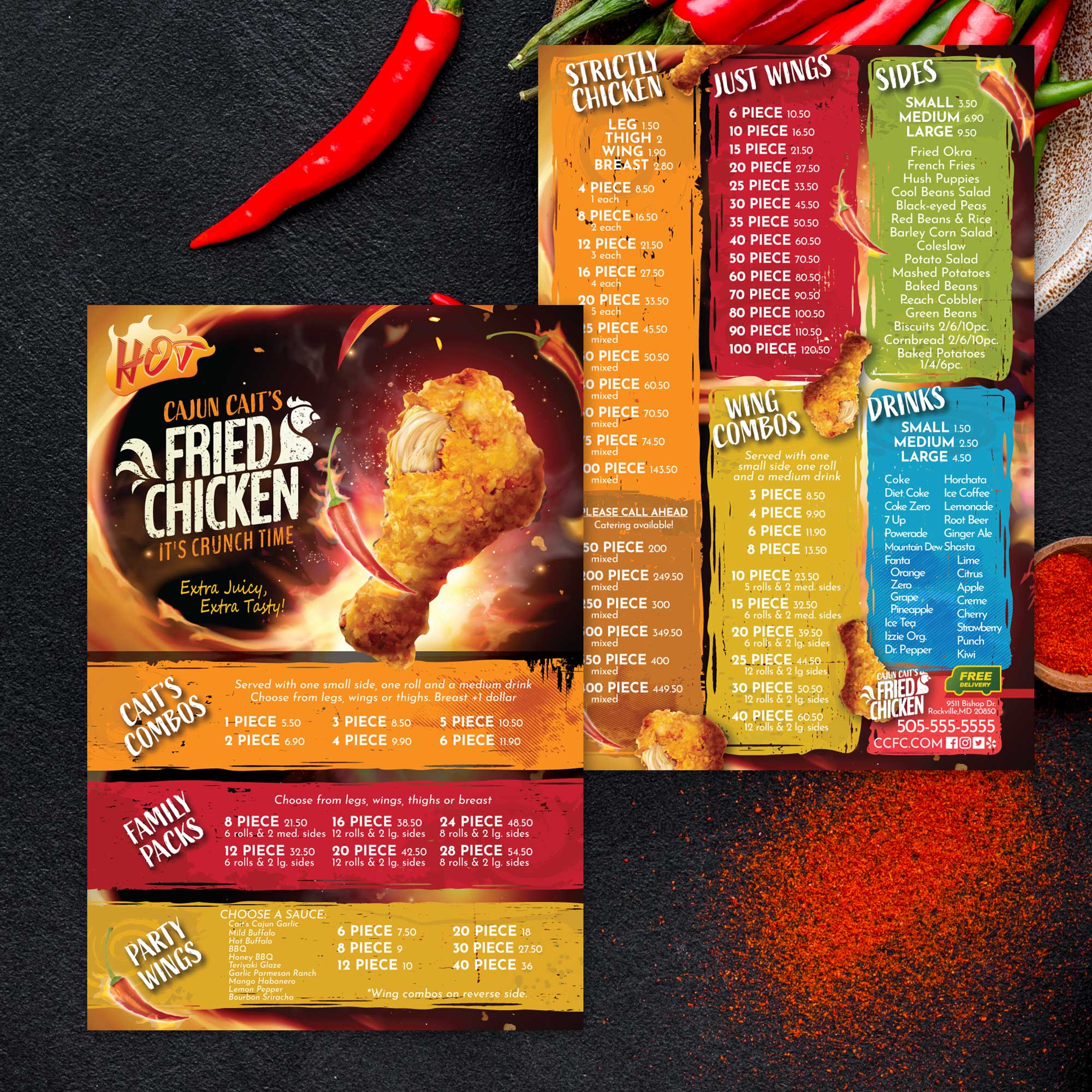
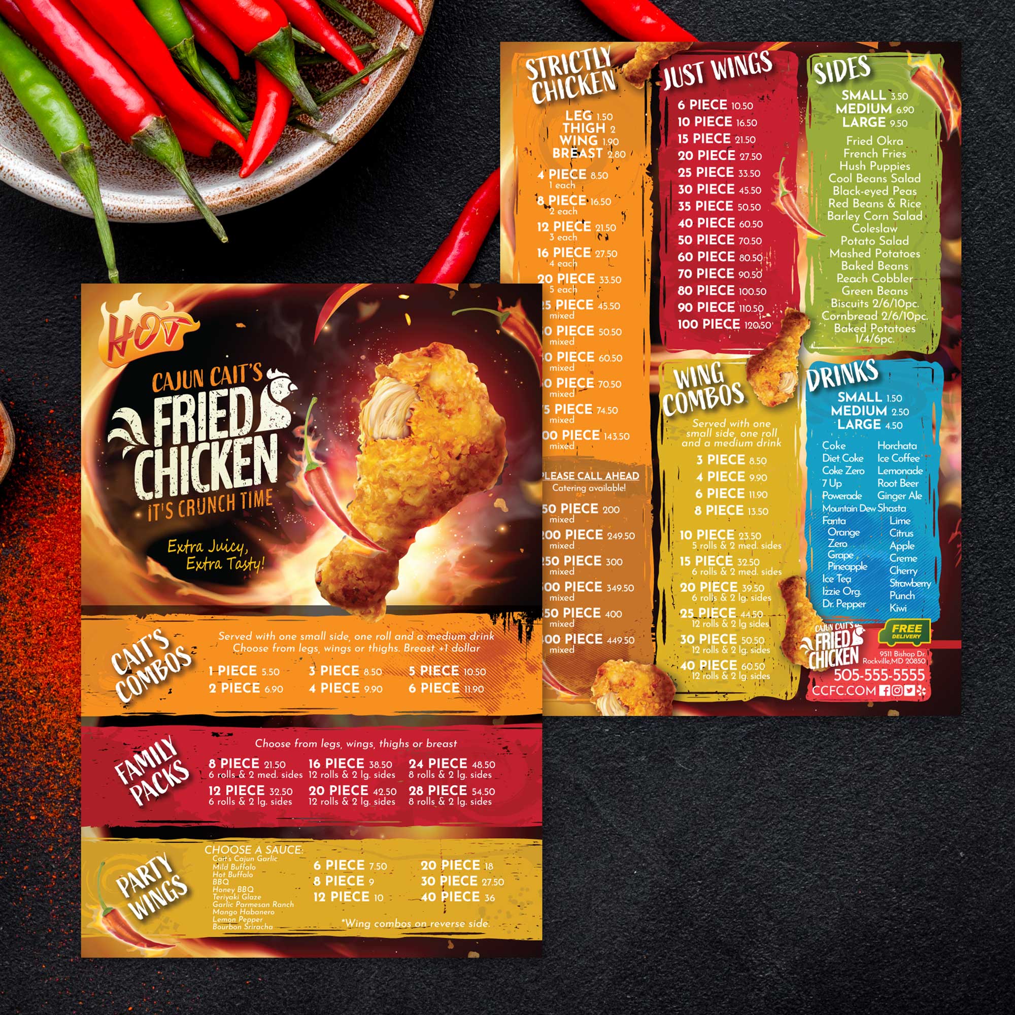
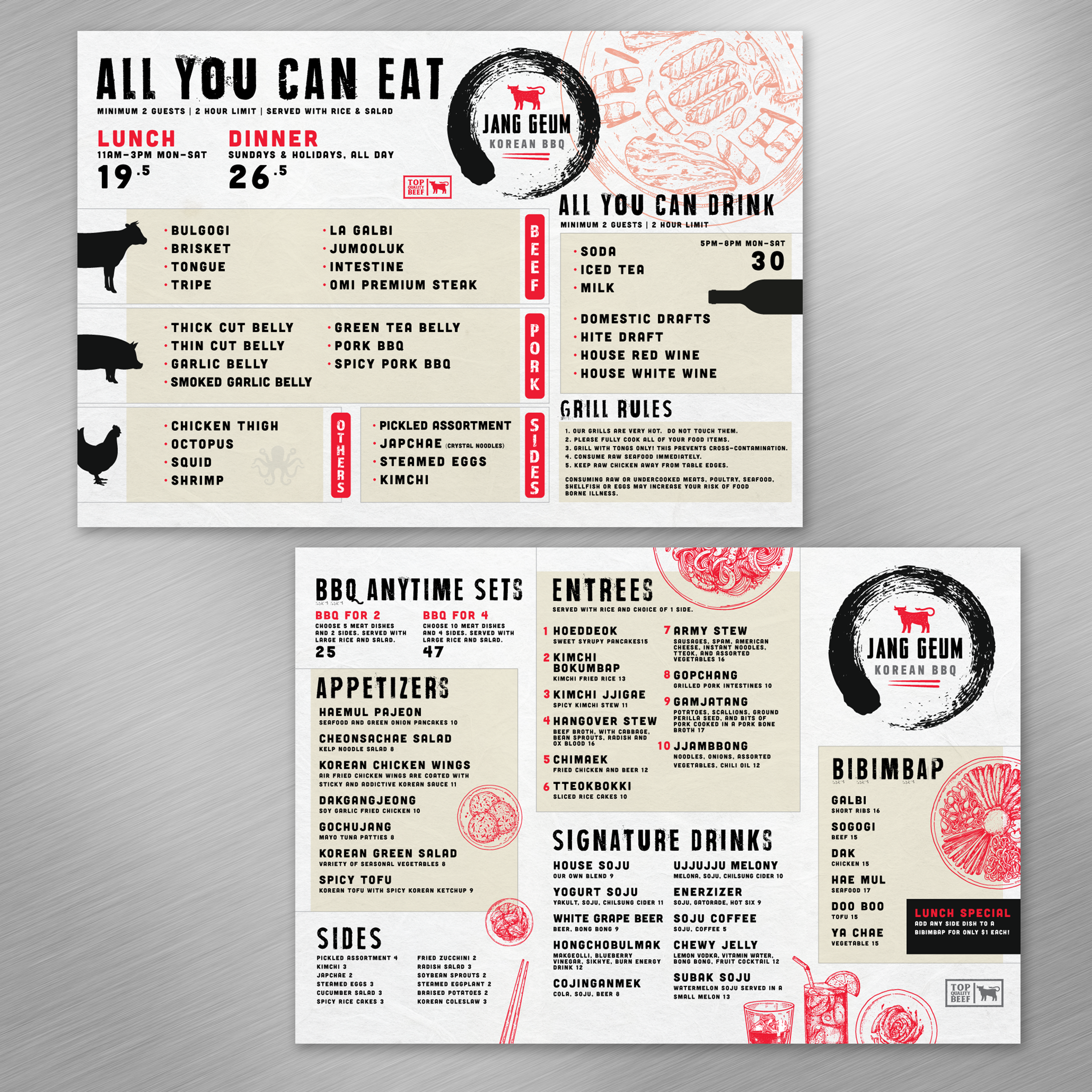
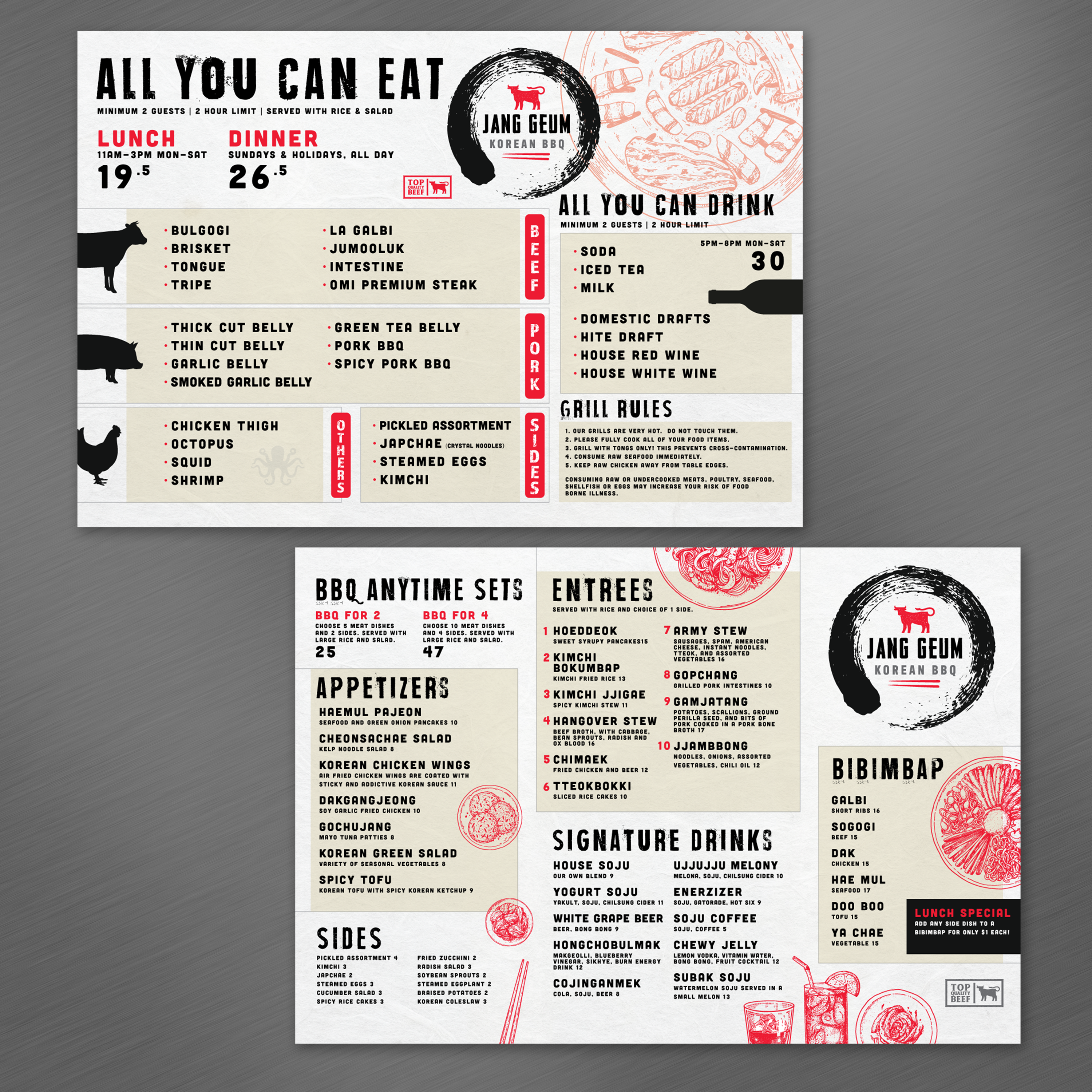
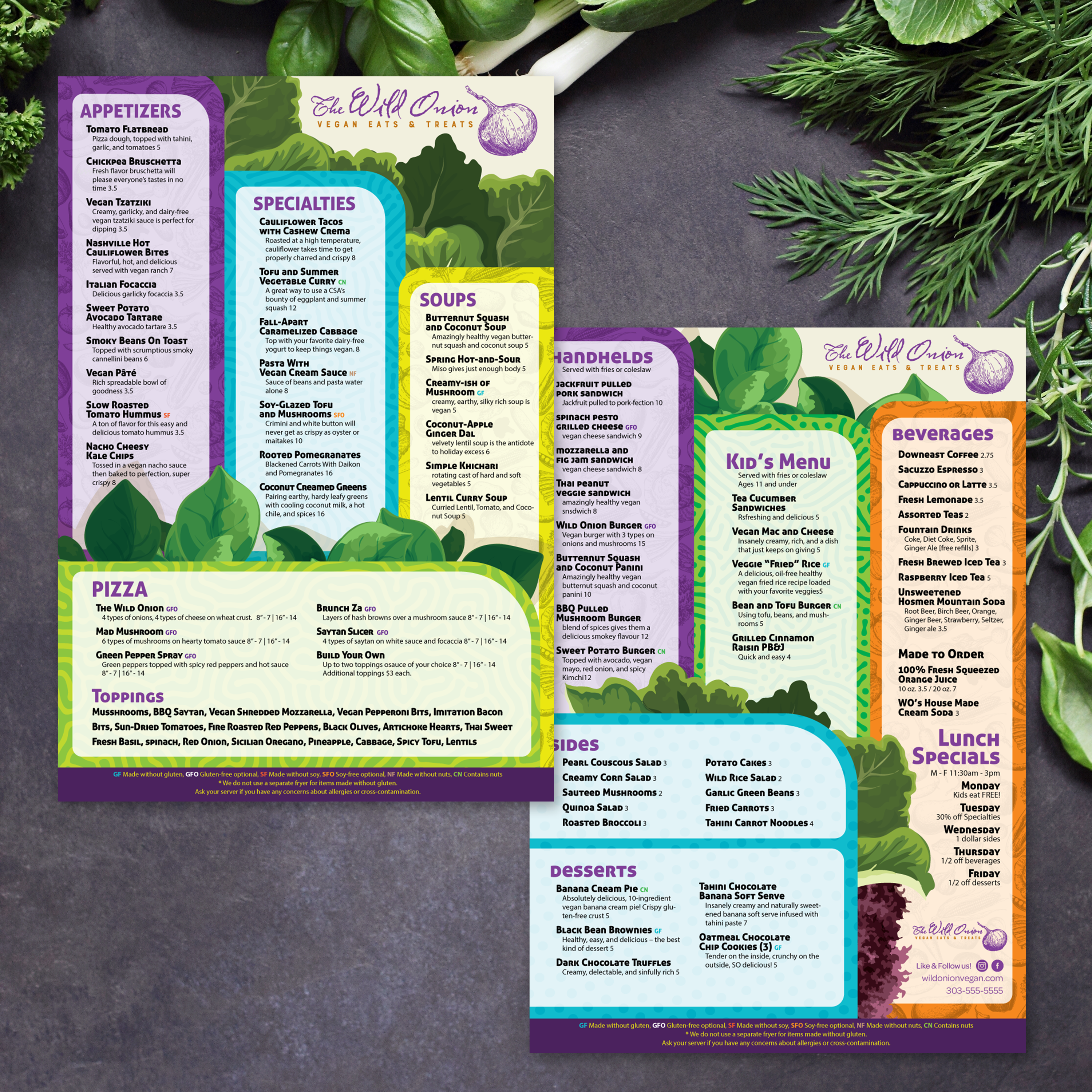
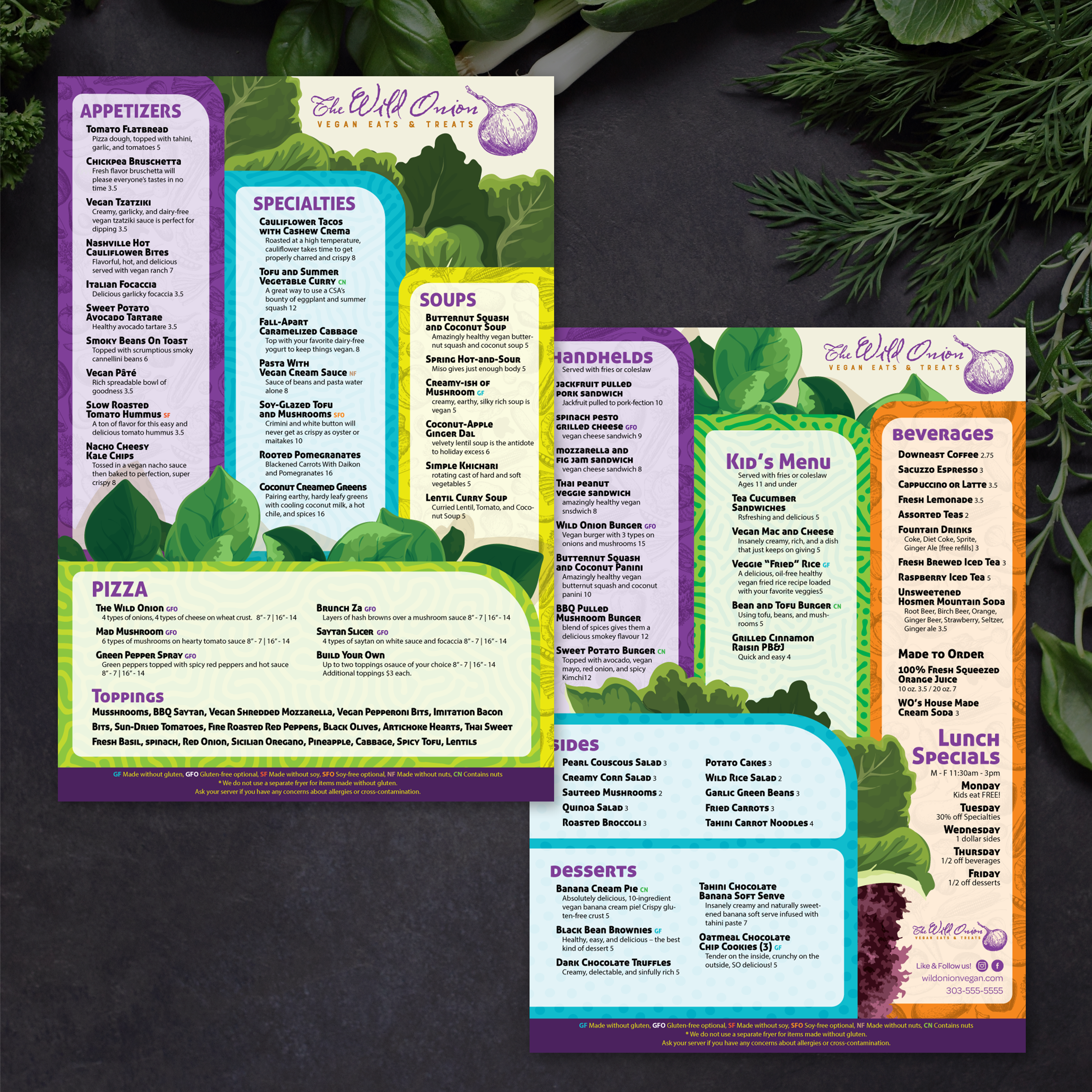
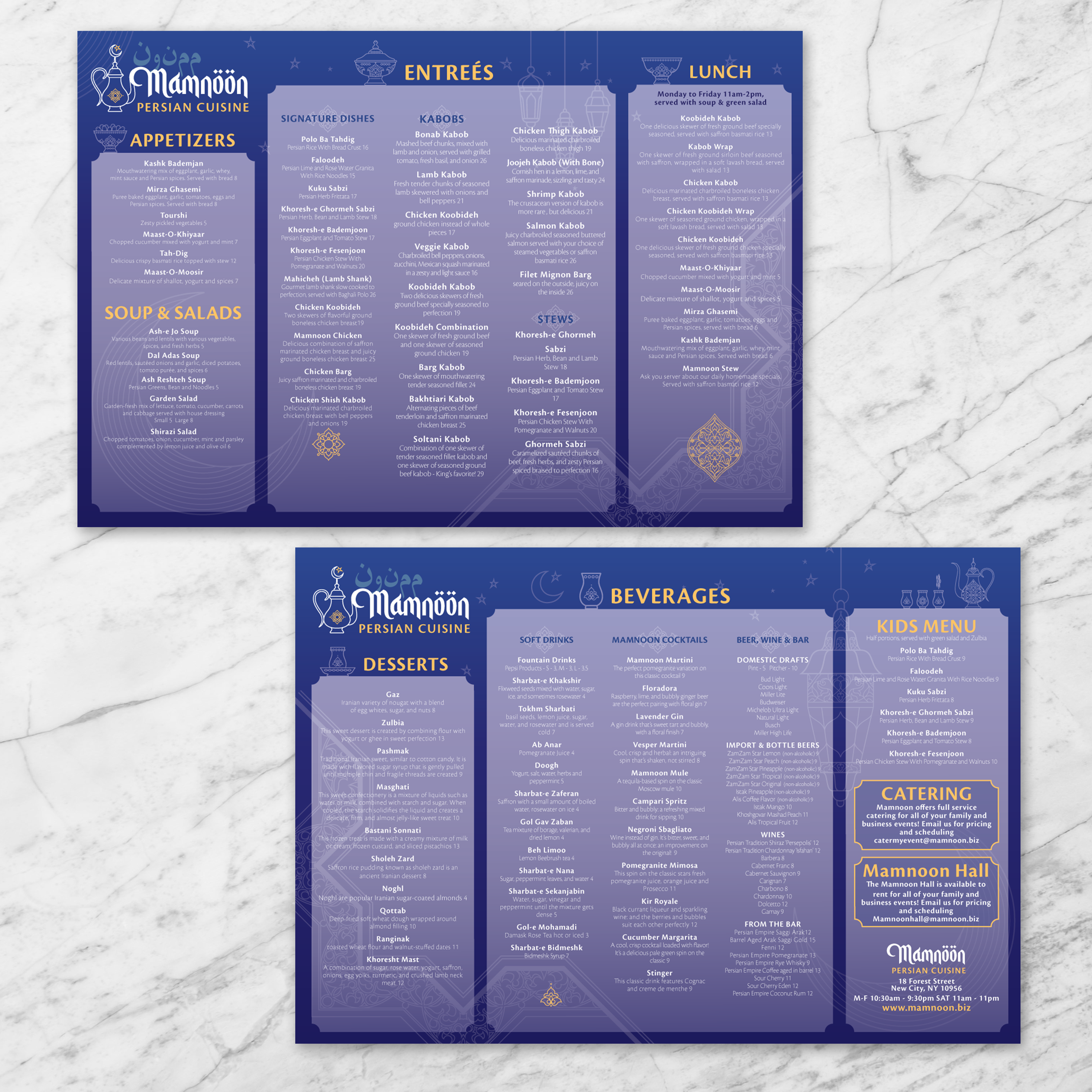
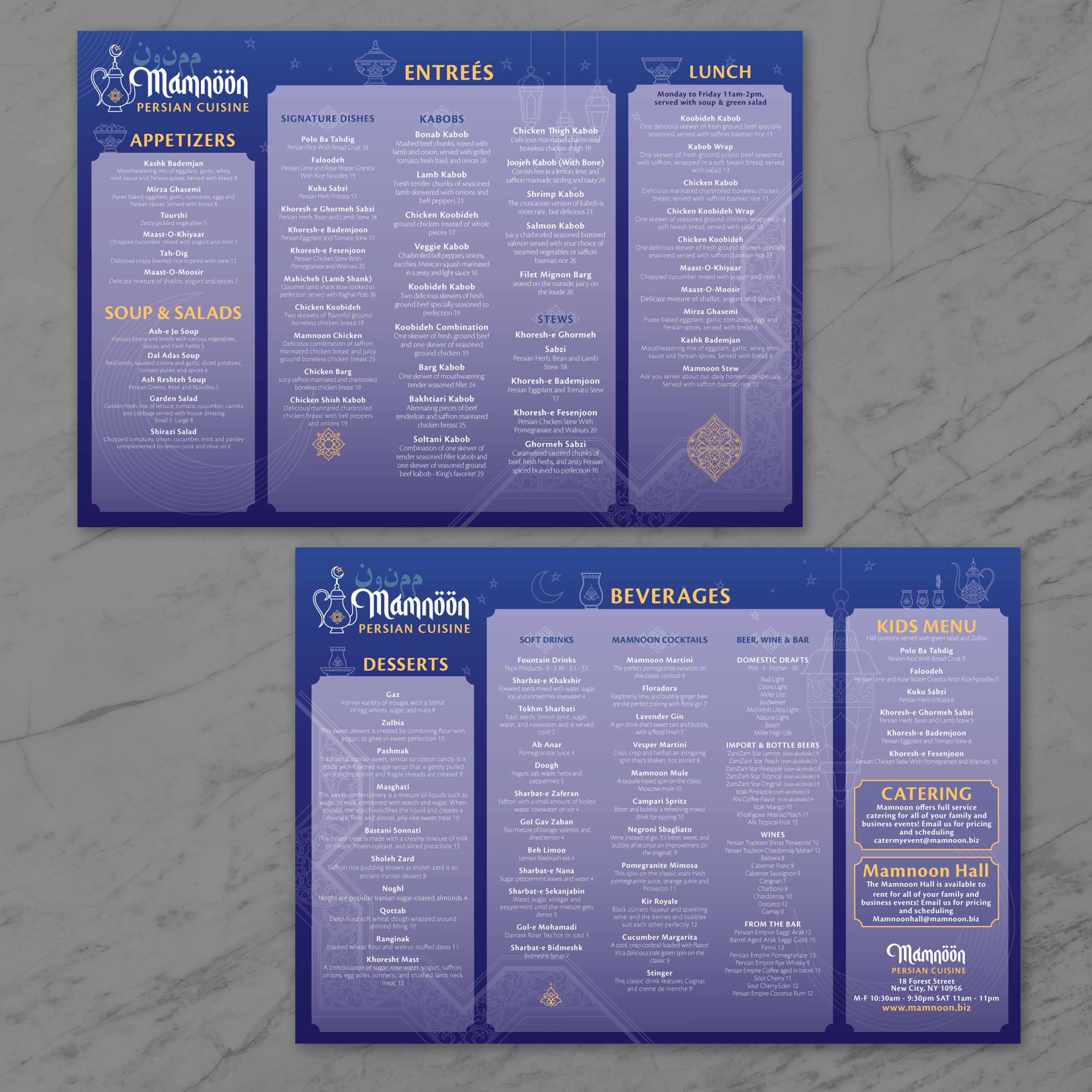
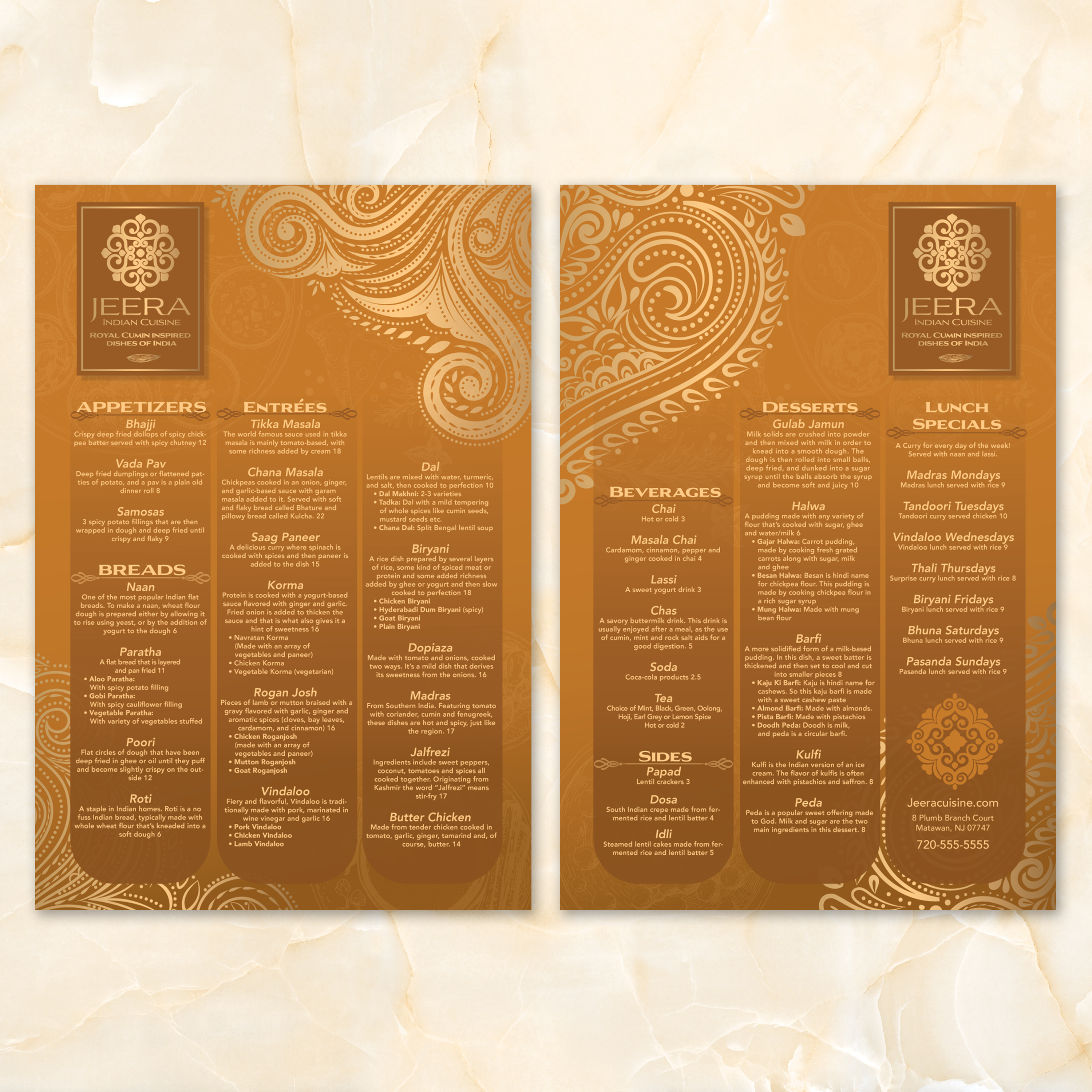
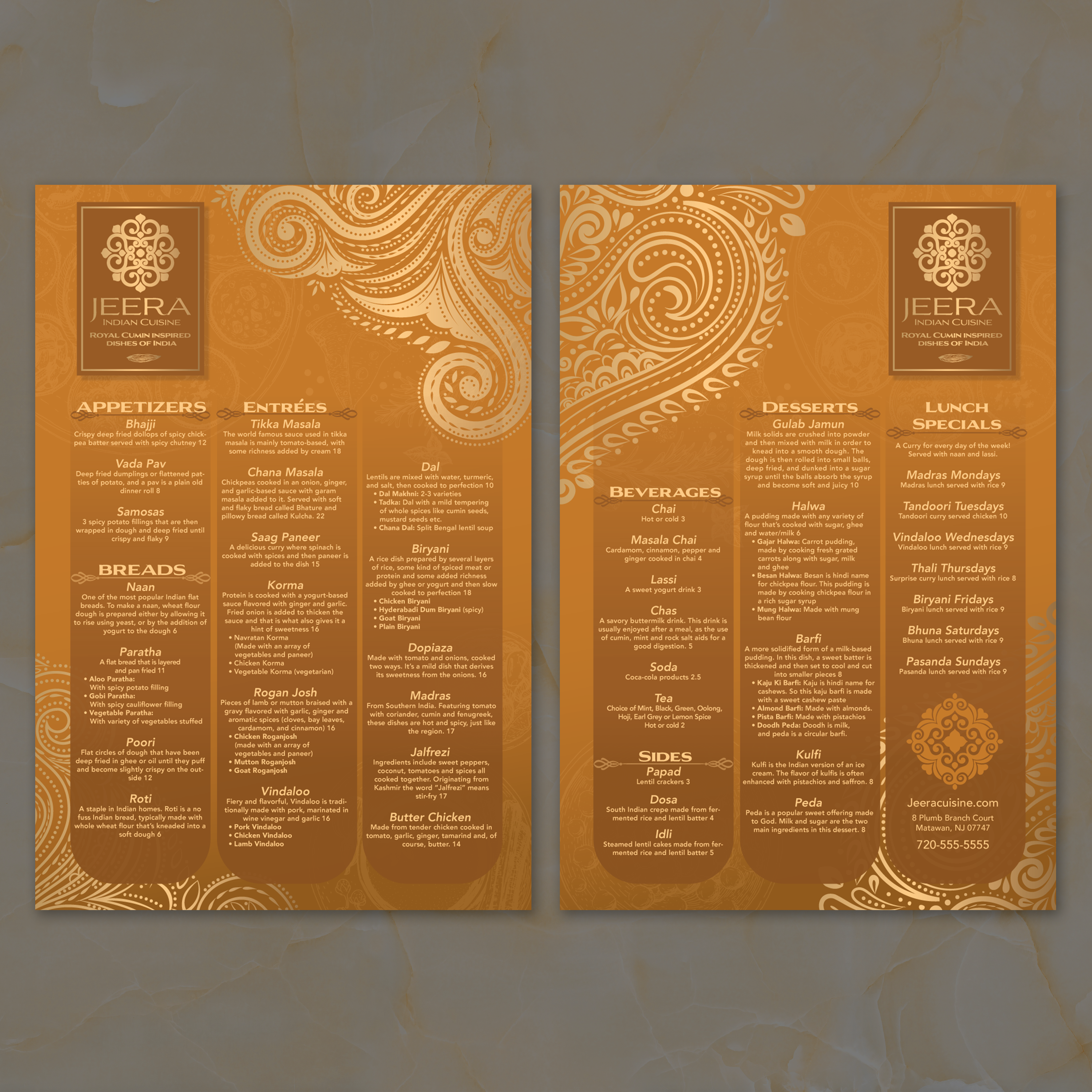
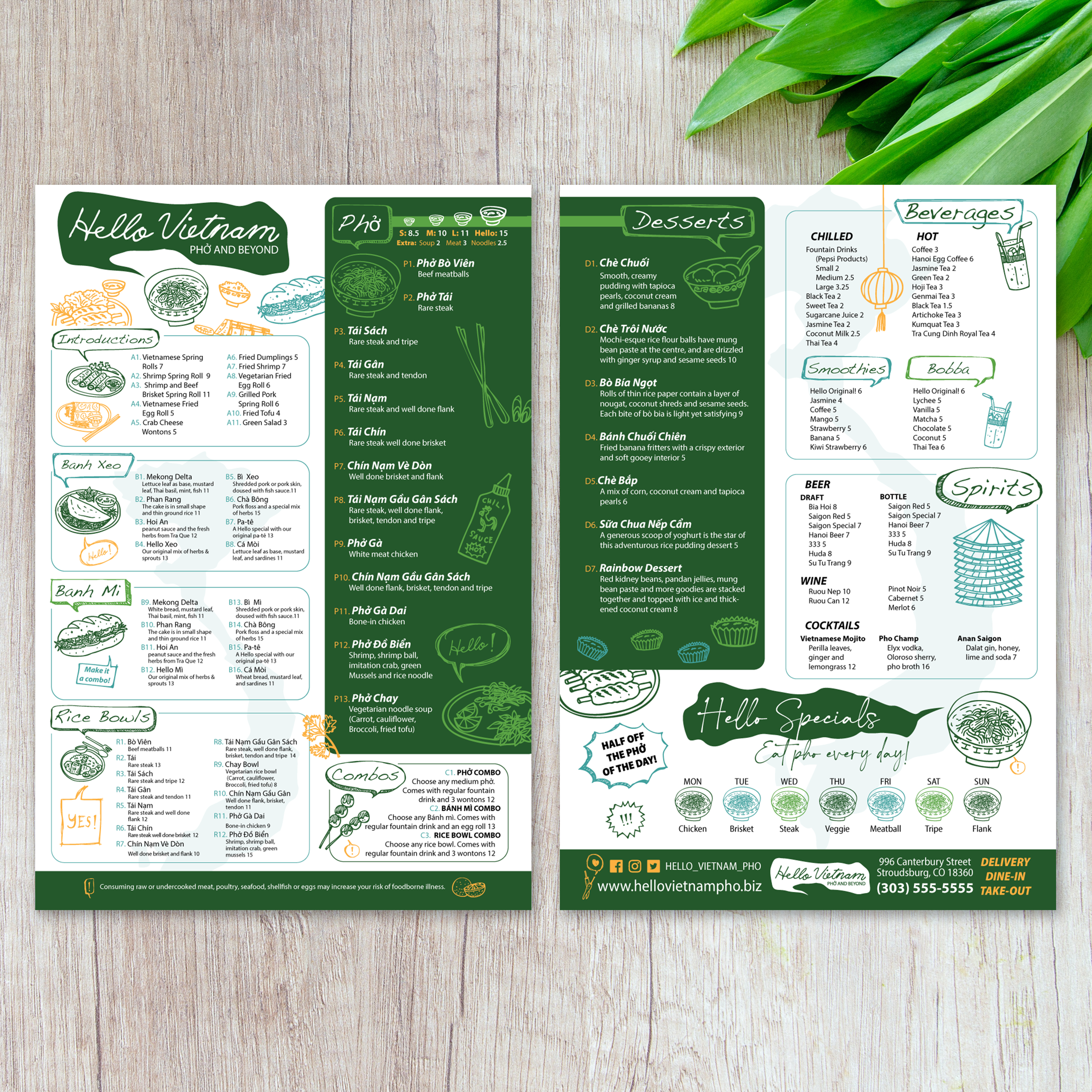
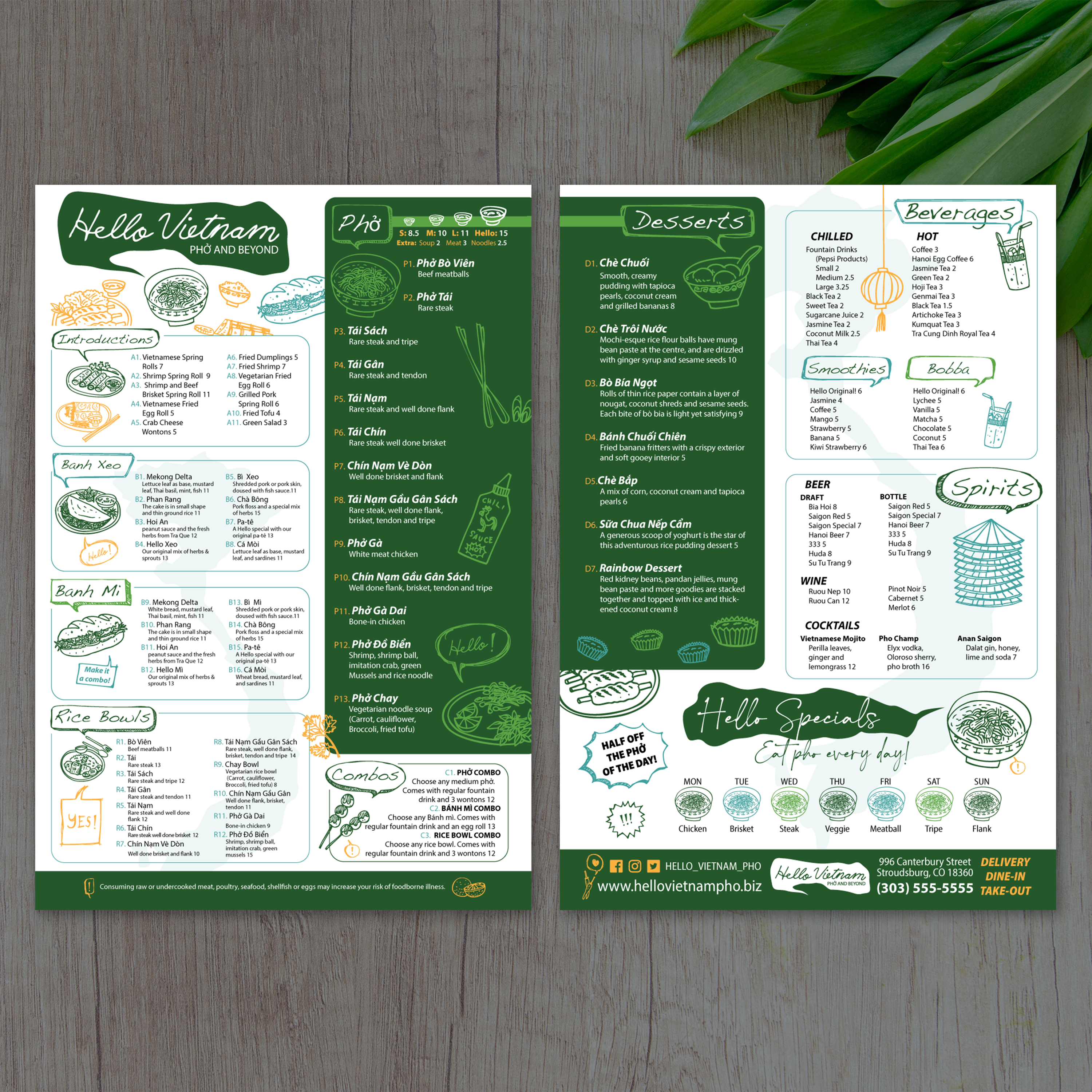
A flat menu provides a full page of space, but the design still requires structure. Without clear sections and visual hierarchy, a single-sheet menu can feel overwhelming. At TerraSlate, we recommend building flat menus around scanning behavior: guests first look for category anchors, then compare items and prices, and finally circle back for descriptions.
Layout Grid Basics: Columns, Sections, and Whitespace
Start with a simple grid. Two or three columns typically work best for 13” x 19” layouts, depending on how many categories you need. Use consistent spacing between sections and lean on whitespace to separate groups. A clean grid makes the menu feel premium, even with a lot of content.
Best Category Flow for Fast Decisions
Arrange categories in the order guests think about them: starters, mains, sides, drinks, then desserts. If your bar program is a significant draw, consider moving drinks to a higher level. Keep related items together and avoid scattering categories across the page. When the flow is predictable, ordering gets faster.
Pricing and Description Formatting That Looks Premium
Use consistent alignment for prices and keep descriptions short and informative. Avoid long paragraphs. Guests want quick clarity: what it is, what it tastes like, and what it costs. Premium formatting is about spacing and consistency, not decorative fonts.
Highlighting Specials Without Making the Menu Look Busy
Specials should stand out, but not overpower the layout. Use a single highlight style, such as a border, a shaded box, or a “featured” label, and place it in a consistent area. Too many callouts make the menu harder to scan and reduce the impact of what you want to sell.
Making the Design Work for Both Dine-In and Takeout
If the same menu supports dine-in and takeout, include easy-to-spot sections for combos, family meals, or quick picks. Keep phone numbers, QR codes, or ordering instructions clean and separated from food categories. If you want a layout example with multiple panels for comparison, our Free 11 x 17 trifold templates can help you see how content density changes when information is split into fold-based sections.